
University ranking tables
QS is renowned worldwide for their annual university rankings since 2004. In 2018, the rankings section on Topuniversities.com had 72 million page views, making it the most popular area of the website. Consequently, the crucial task was to ensure an acceptable percentage of this traffic ventured further into our website, utilised our tools and registered— a mission of great importance.
I was tasked with redesigning the layout for all ranking table pages. My goal was to enhance the discoverability of tools and increase registration figures while simplifying the template. The key was to strike a harmonious balance between business requirements and user satisfaction.
MY ROLE
building tables
Running from March to April 2019, I led this project, taking charge of the research, user experience, and prototyping. The visual design was handed off to my Bangalore-based team for project delivery, and I also worked in collaboration with the Product Owner, Senior Vice President (Head of QS Intelligence Unit), project management and development teams.
I was fully responsible for strategising the UX, gathering requirements, research, producing UX deliverables, prototyping and copywriting.
the challenge
bringing up the numbers
The prime challenge was to simplify a rankings table page when every department in the company wanted to cross-promote their offerings using this highly frequented space. Stakeholder management was a crucial component of this project.
The project's main objective was to drive registration by increasing traffic to other areas of the website, particularly the newly released programme matching tool. I was also tasked with exploring innovative ways to drive registration on the table page itself and with simplifying the layout to ensure an intuitive user journey.
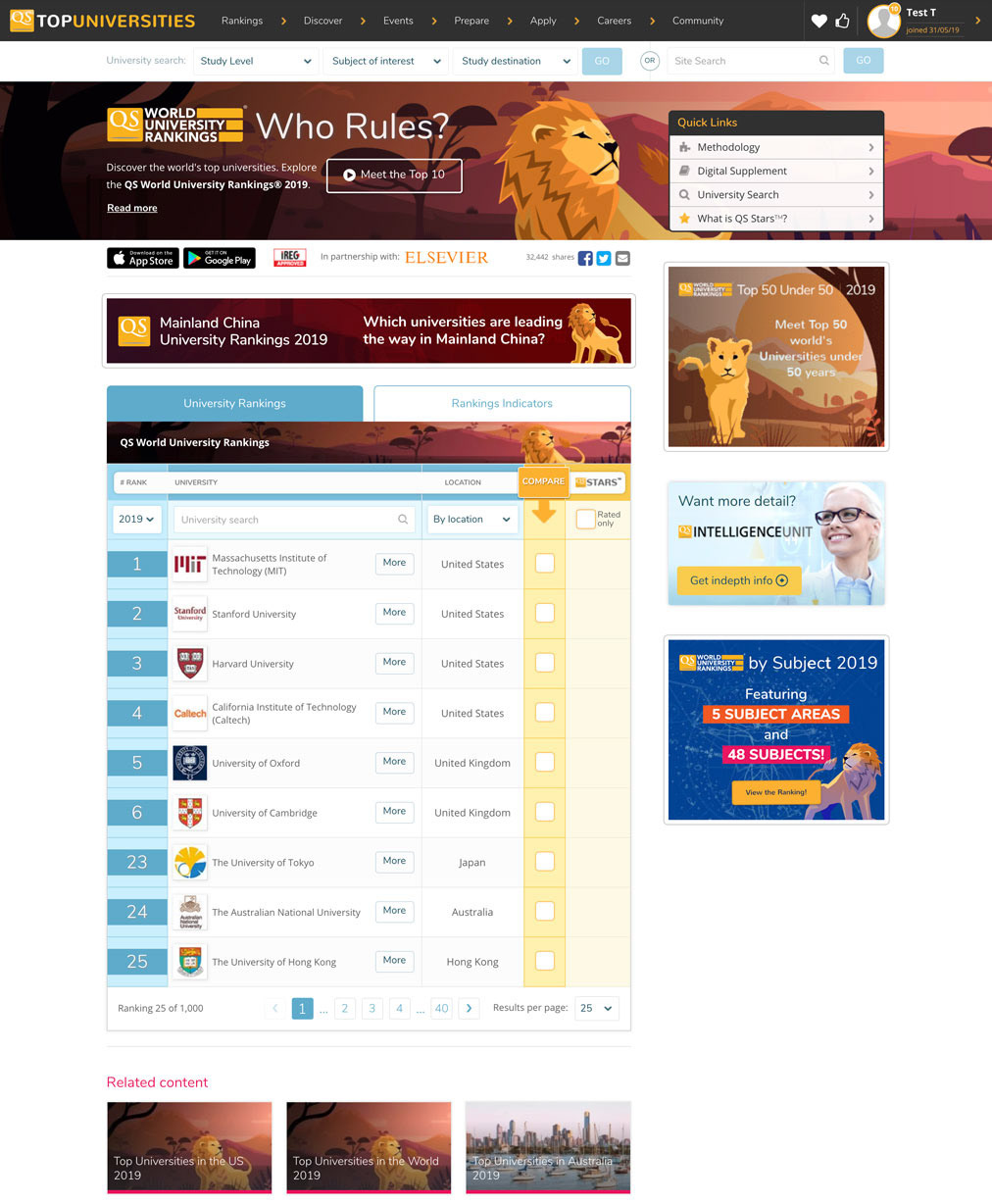
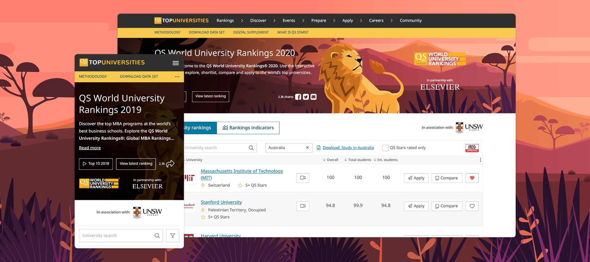
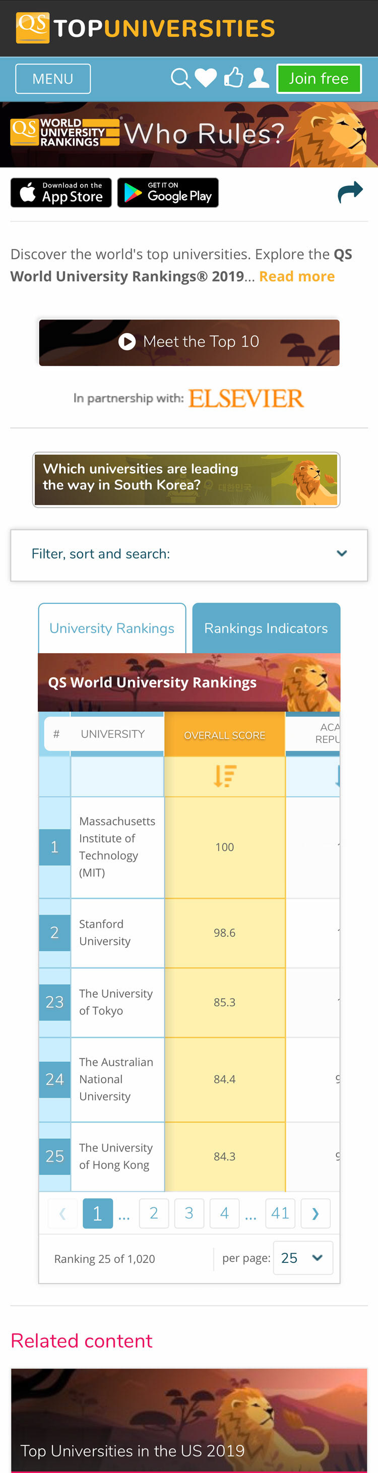
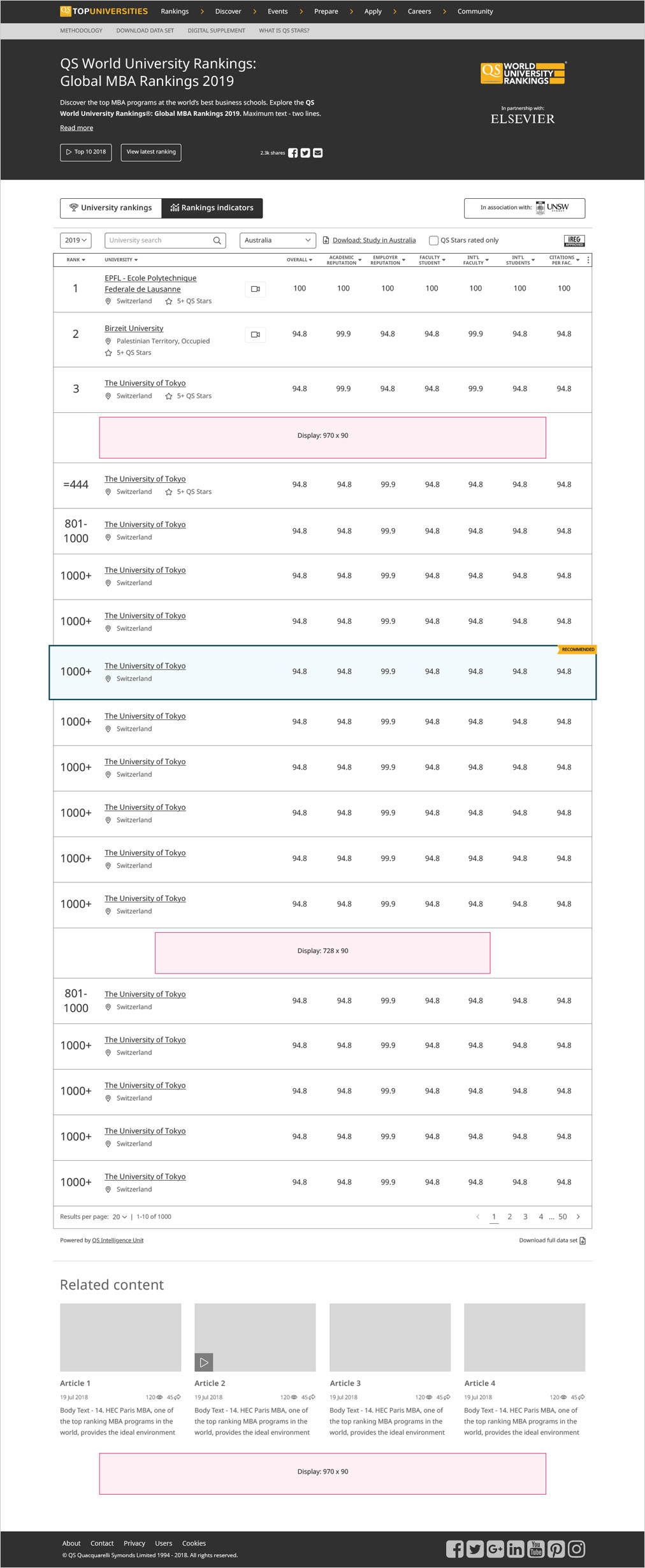
Current rankings table page - Rankings - Desktop
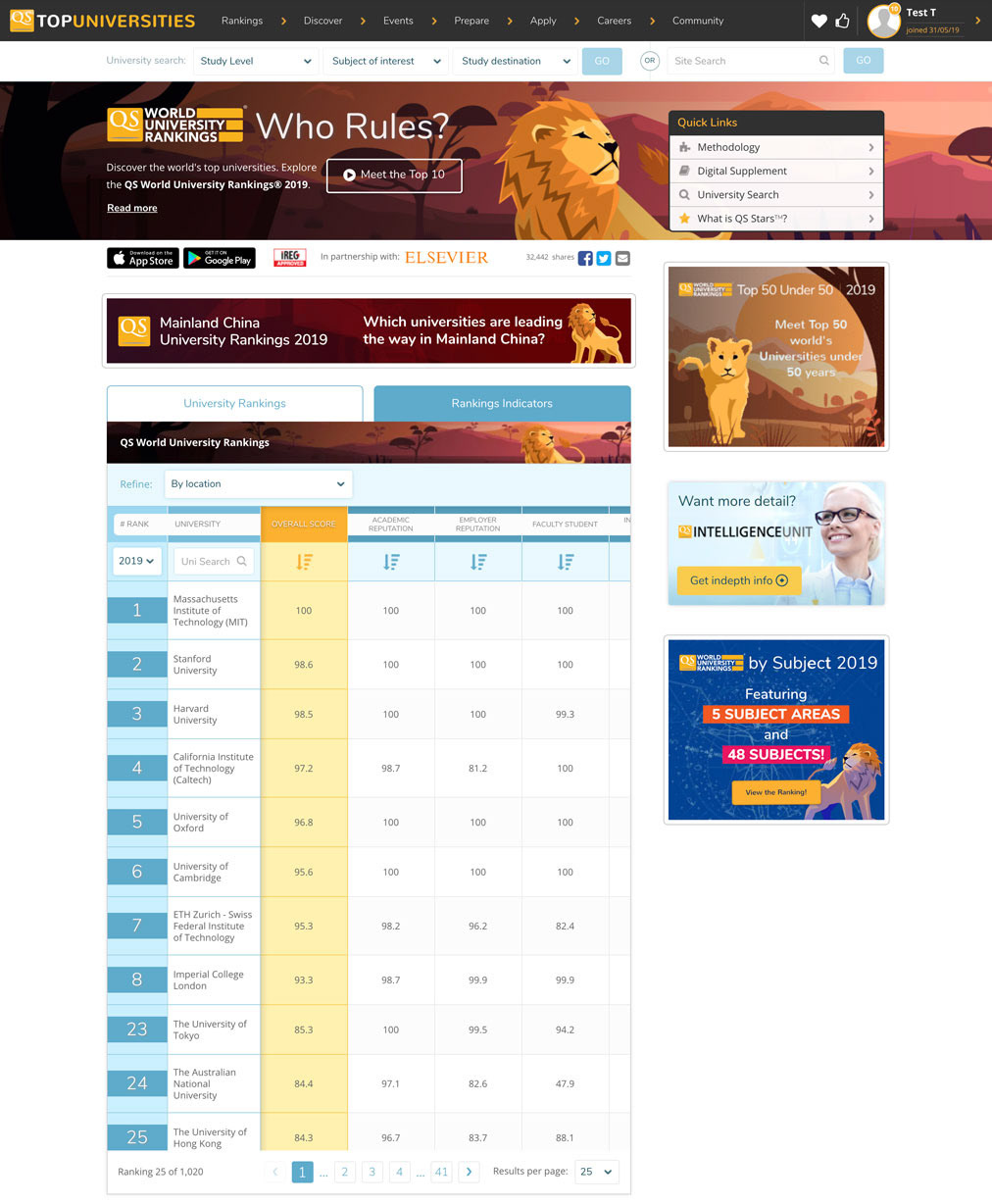
Indicators - Desktop
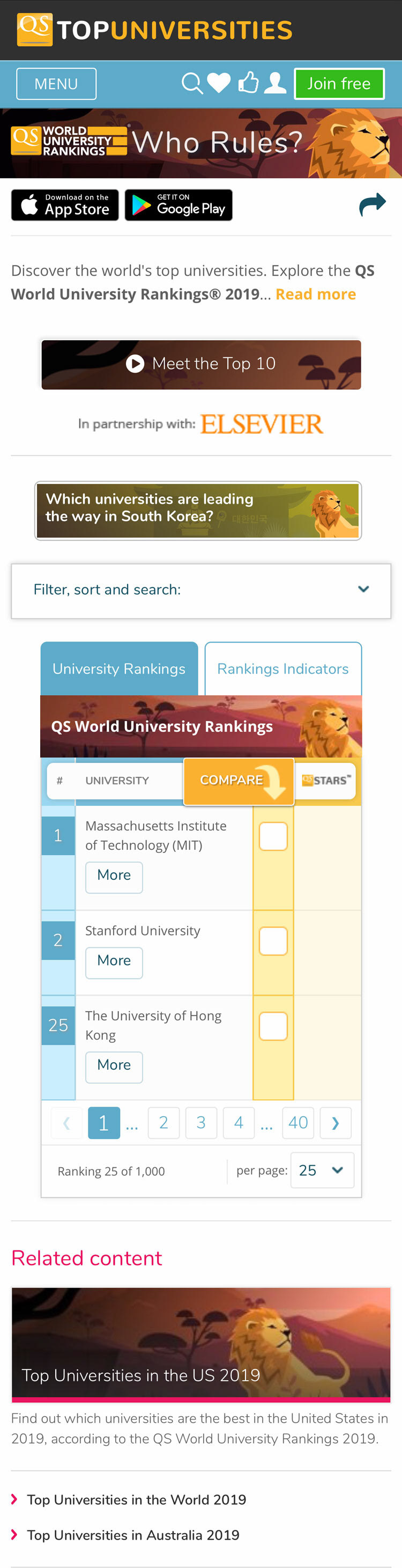
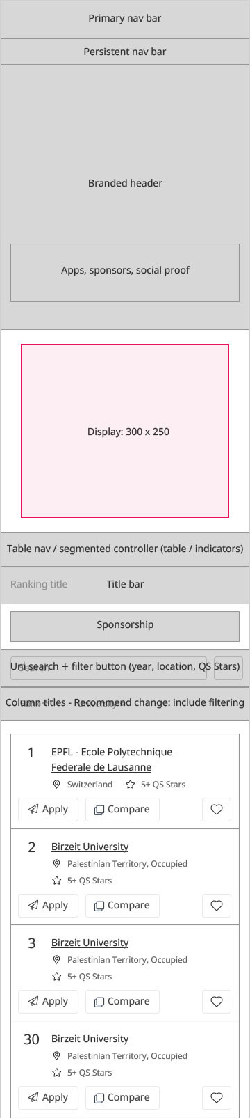
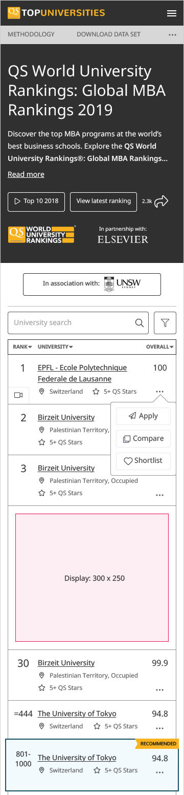
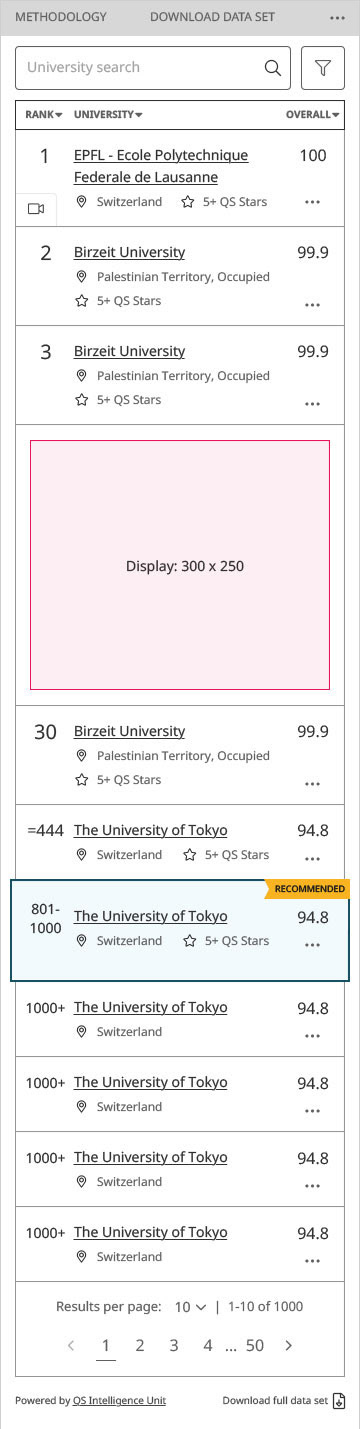
Rankings - Mobile
Indicators - Mobile
kick-off
meeting of minds
I held a workshop involving key stakeholders from the Intelligence Unit, product, development and project management teams. We defined our design strategy, generated ideas, and identified key user tasks, issues with the current design, and potential improvements. We also agreed upon the project's critical success factors and determined which design components to remove. The importance of branding aspects on each page was highlighted to ensure differentiation between the multiple ranking releases each year.
collecting the data
research & User-centred ANALYSIS
The project began with a heuristic evaluation and exploration of various registration funnels. This revealed numerous usability issues and an extremely cluttered interface due to stakeholders adding components for their departments, often to the user's detriment.
Google Analytics data was used to understand user behaviour and typical user journeys. Heat-mapping via HotJar indicated that search fields and pagination controls were areas of high engagement on both desktop and mobile platforms. It also revealed that users were comfortable scrolling to acquire needed information.
Time and budget constraints meant user-focused workshops were not feasible. Instead, we engaged users throughout the prototyping process. Using data collected during the research phase, I updated our personas and created scenarios. A task flow diagram was also created to identify opportunities for improvement or features and functions that support user tasks.
We gathered information on user demographics and visit intentions via a HotJar survey (2,889 participants) on the ranking table pages. This data assisted decision-making regarding component removal and facilitated stakeholder management.
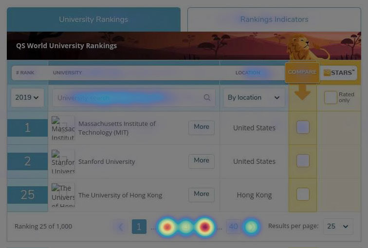
Hotjar heatmap - Desktop
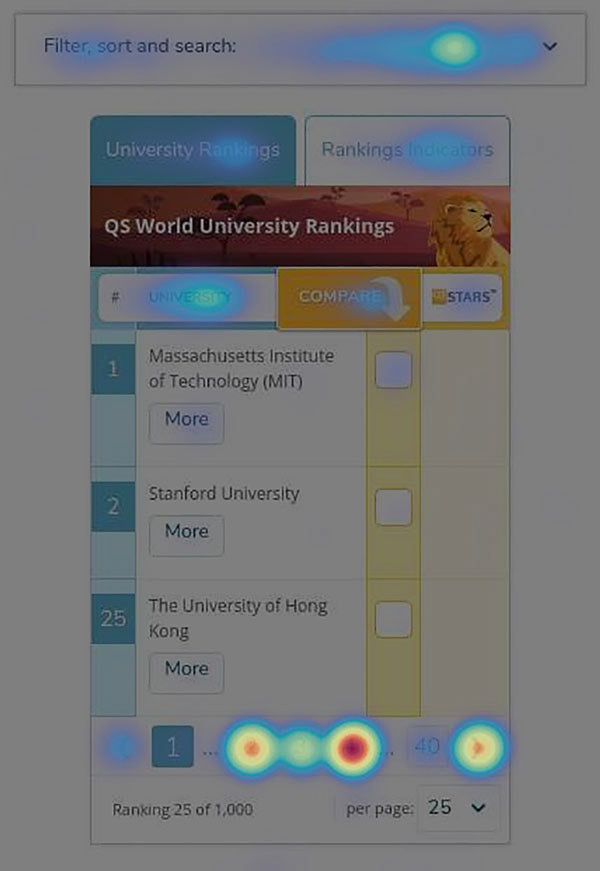
Hotjar heatmap - Mobile
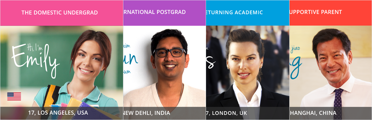
Personas
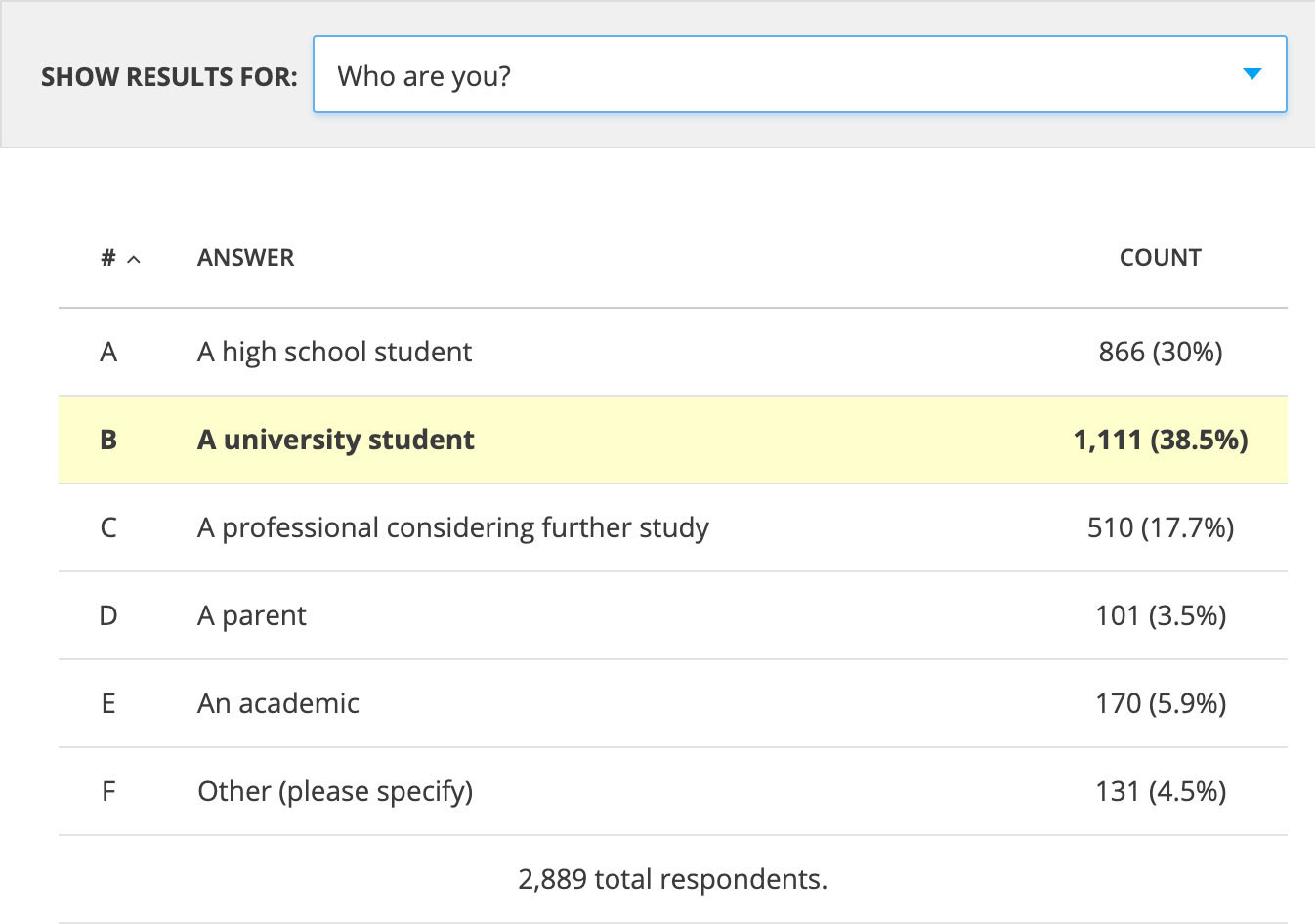
Hotjar survey - Ranking table pages
prototyping
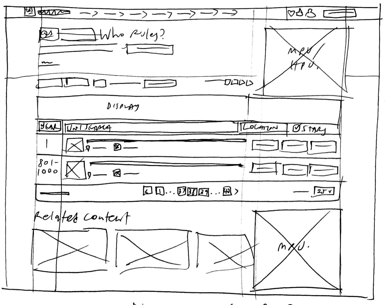
I began by sketching initial desktop layout ideas for a table using the current two-column layout and proposed a new single-column layout spanning the full-width of the page. Once the Product Owner agreed to this innovative approach, I progressed to creating low-fi prototypes.
These prototypes went through multiple iterations before finalising designs for both desktop and mobile. User testing was focused on key user tasks and the feedback gathered was primarily positive. It was decided to proceed with these designs but perform multivariate testing post-launch.
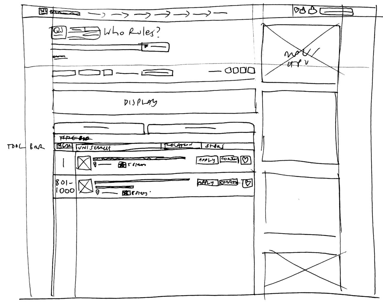
Paper prototype - w/ RH column - Desktop
w/ section breaks + MPU
Full-width table w/ large leaderboard
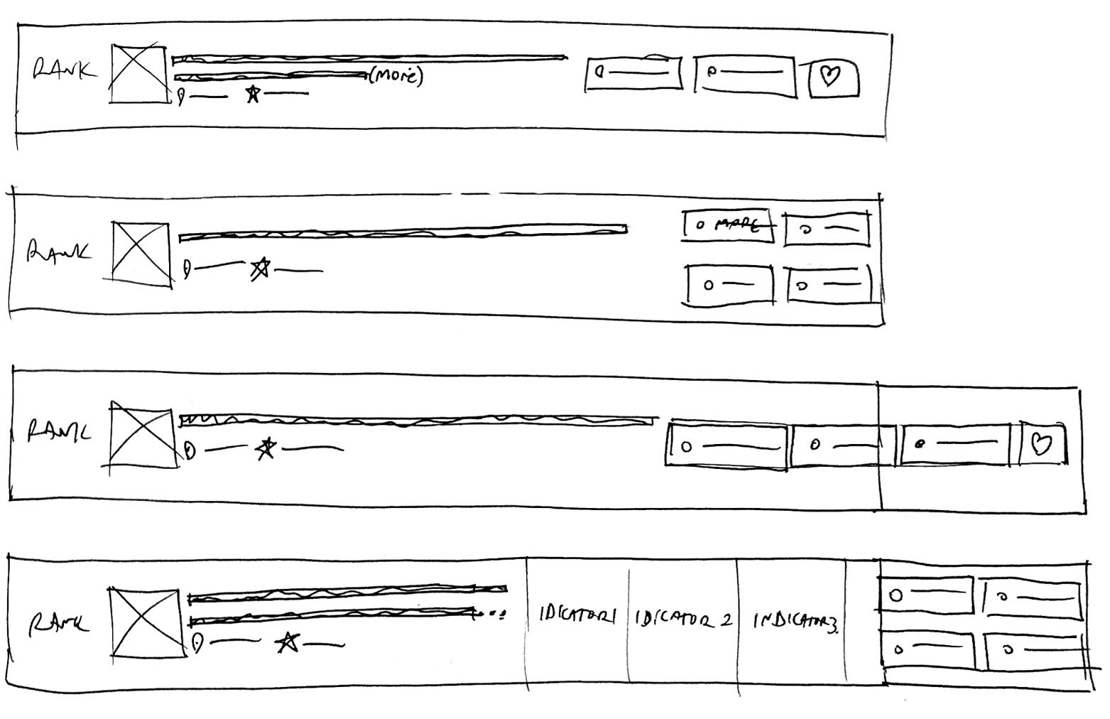
Card ideas
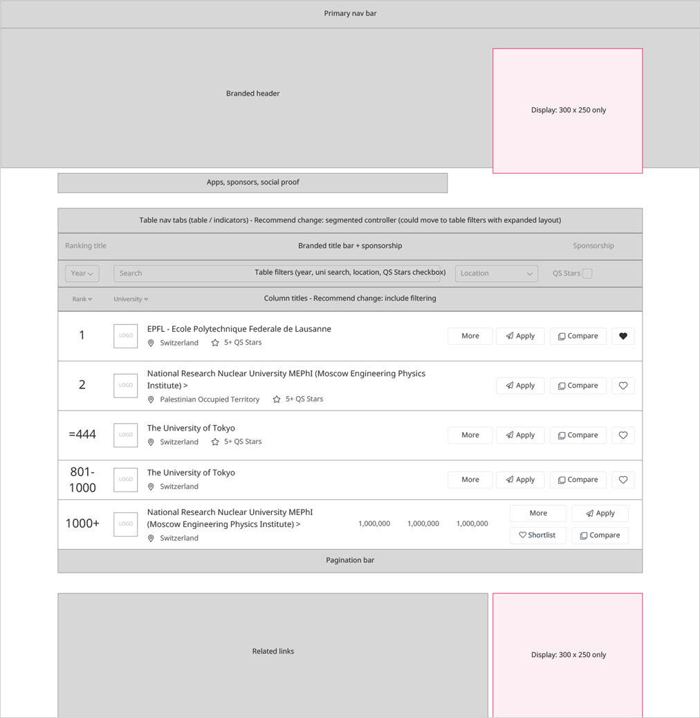
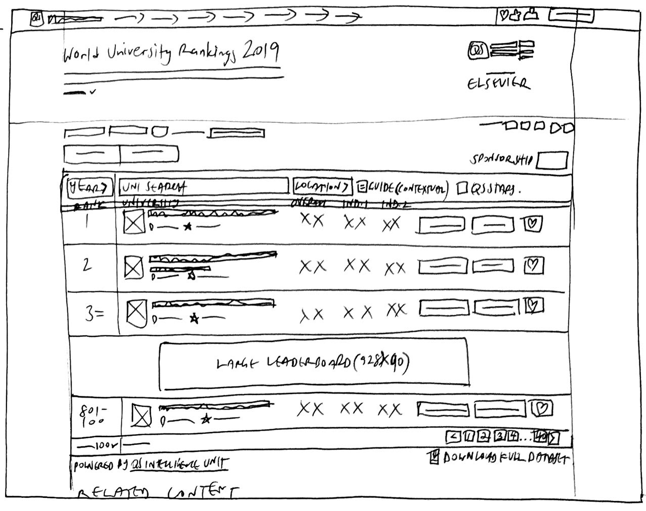
Low-fi prototype - Desktop
Hi-fi prototype 1 - Desktop
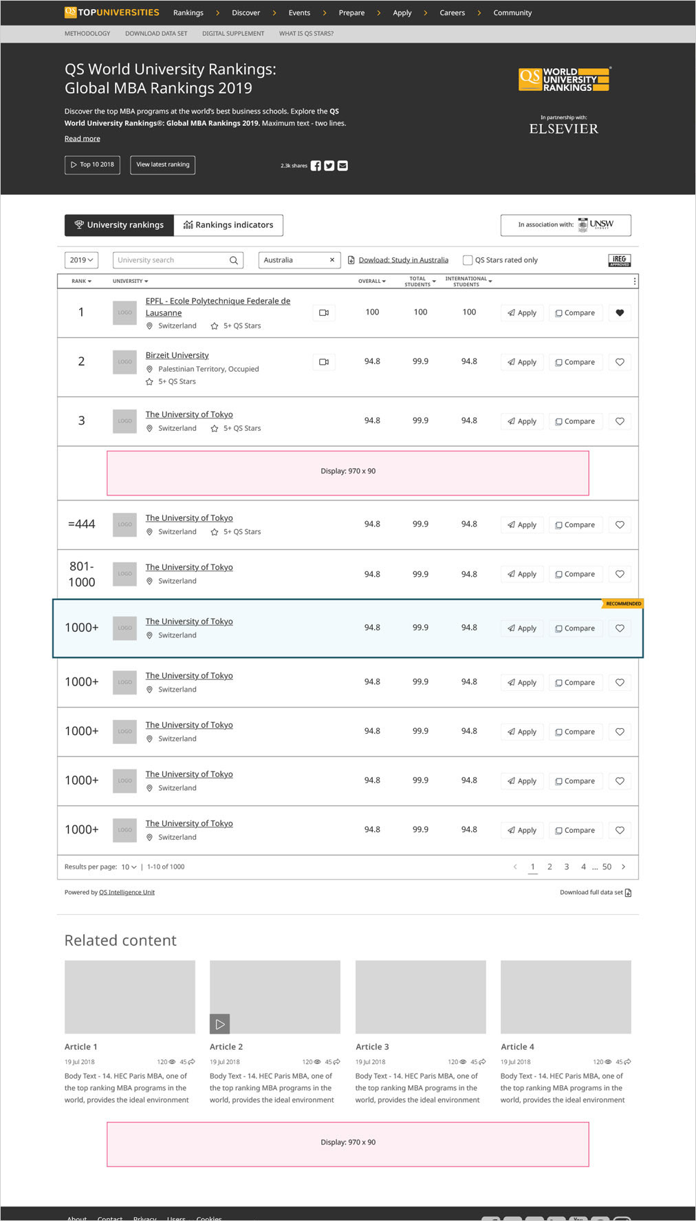
Hi-Fi prototype 2 - Desktop
design
ui & interactions
Upon completing the prototyping stage, the visual design aspect of this project was entrusted to my Bangalore-based team. I supervised their progress closely, ensuring that brand coherence was maintained and that interactive aspects aligned with our specifications. Soon enough, desktop and mobile versions were meticulously prepared, primed for development.
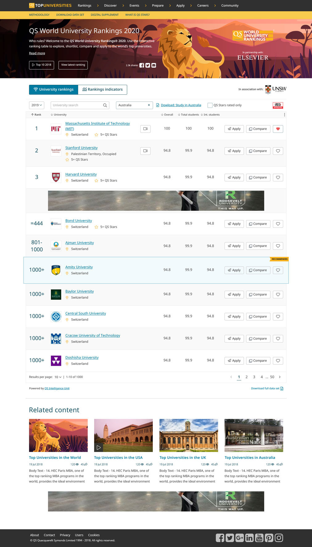
Rankings table page - Preliminary UI - Desktop

Preliminary UI - Mobile
the LAUNCH
5… 4… 3… 2… 1... We have lift-off!
The design I crafted saw its launch in the summer of 2019, following my departure from the company. It was a significant event, perfectly coinciding with the QS World University Rankings - a time when traffic to the site typically peaks. The launch showcased the fruits of our labour - an improved layout, a simplified interface, and enhanced tool discoverability. Despite my absence during the launch, it was a gratifying moment, knowing that the design I had contributed to was coming alive and serving its intended purpose.
the impact
waiting for the numbers to come in...
Unfortunately, as I was made redundant at the start of summer 2019, I was unable to personally assess the project's impact post-launch. However, robust performance indicators were put in place, and the team was committed to conducting a comprehensive evaluation of the project's outcomes, tracking registration numbers, user engagement, and other metrics.
retrospective
time is of the essence
Reflecting on the project from my tenure, I am pleased with the solution I was able to deliver within the constraints of time and budget. While I would have relished the opportunity to work on the UI and interactions more intimately, and engage users from the onset of the research phase, the circumstances taught me valuable lessons about operating within strict timeframes and limited resources.
One key takeaway is the importance of involving users at all stages, even when there are budget and time constraints. For future projects, I will endeavour to ensure that important aspects, such as redesigning the shortlisting and comparison tools, are not left out due to pressing timelines.
Despite the challenges, this project reiterated to me that effective solutions require a harmonious balance between business requirements, stakeholder interests, and, above all, user needs.
If you're interested in my work or would like to discuss it further, please don't hesitate to drop me a message!