
programme matching tool
Back in 2017, Topuniversities.com had a vision: a tool to connect students with their ideal universities. However, with a modest budget allocated for user testing, the challenge was clear. This is the story of how I, as a UX Manager, directed a multidisciplinary team to develop an innovative programme matching tool for TopUniversities.com and TopMBA.com.
MY ROLE
SETTING THE COURSE
Spanning from February 2018 to March 2019, I led this project, steering a remote, external agency through the research phase. Following this, I guided an internal UX team of four specialists - including Researchers, UX Designers and Visual Designers - towards project completion. Teaming up with the Product Owner, CTO, project managers and development teams, we pooled our expertise to bring this project to life.
the challenge
RISING ABOVE THE COMPETITION
Competitor analysis revealed several programme matching tools already in the market. However, we had an ace up our sleeve: a unique feature allowing direct applications to partner universities via our MoveIn software, accompanied by application status tracking. Our goal was to engage and nurture qualified leads throughout the process, using the matching tool to gauge candidate suitability against university acceptance criteria. The trick was to balance data collection with user engagement.
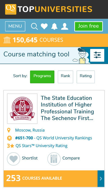
Landing page - Matching tool v1 (2017 launch)
Results screen - Desktop
Landing page - Mobile
Results screen - Mobile
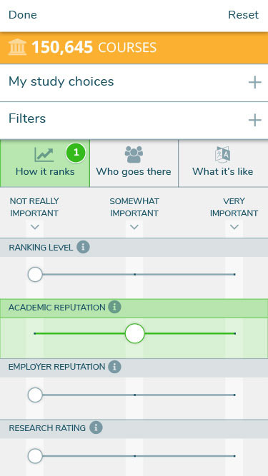
Filters - Mobile
kick-off
BRINGING IT ALL TOGETHER
The adventure began with a strategy meeting among product and technology teams. Faced with tight deadlines, we decided to outsource the research phase to an Indian agency. This choice also gave us direct access to our largest user group during the research phase. Simultaneously, I began assembling a team in Bangalore to manage the remainder of the project.
collecting the data
EMBRACING USER-FOCUSED ANALYSIS
Our external agency was equipped with our design strategy, process outlines, and expected deliverables. To assist participant recruitment, we provided existing personas. Ethnographic research and participatory methods helped us understand user tasks, pain points, and potential improvements. These insights led us to learn that our primary user group, the 18-24 age demographic, preferred simplicity and easily accessible information.
Guided by this data, we updated our personas and devised scenarios, task analysis, process flow and journey maps. A HotJar survey on an early version of the tool further illuminated user preferences and areas for improvement.
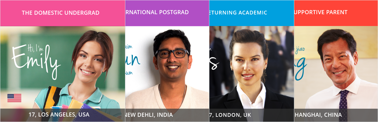
Personas
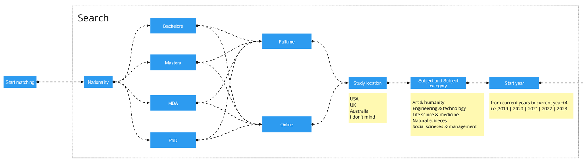
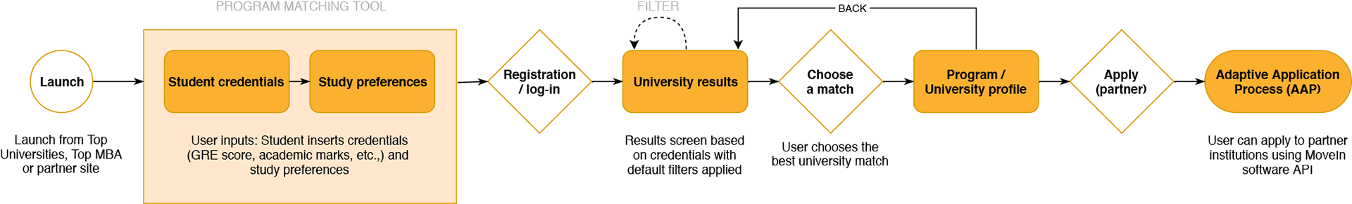
Process flow
A section of the user journey mapping
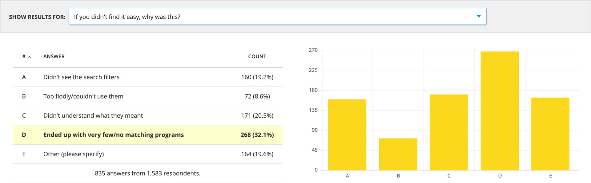
HotJar survey on Matching tool v1
prototyping
TURNING CONCEPTS INTO REALITY
We divided key steps - wizard, site registration, results, and common functionalities - among the team, encouraging close collaboration. After agreeing on a first iteration and gaining approval from the Product Owner and CTO, we forged ahead.

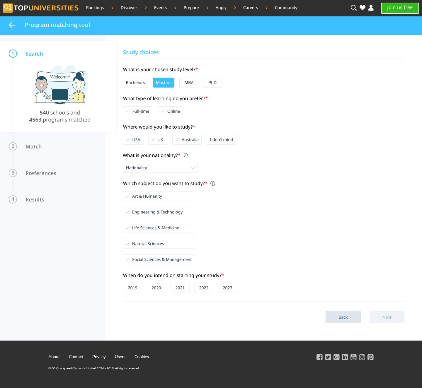
Paper prototyping - Wizard - Steps 1-2
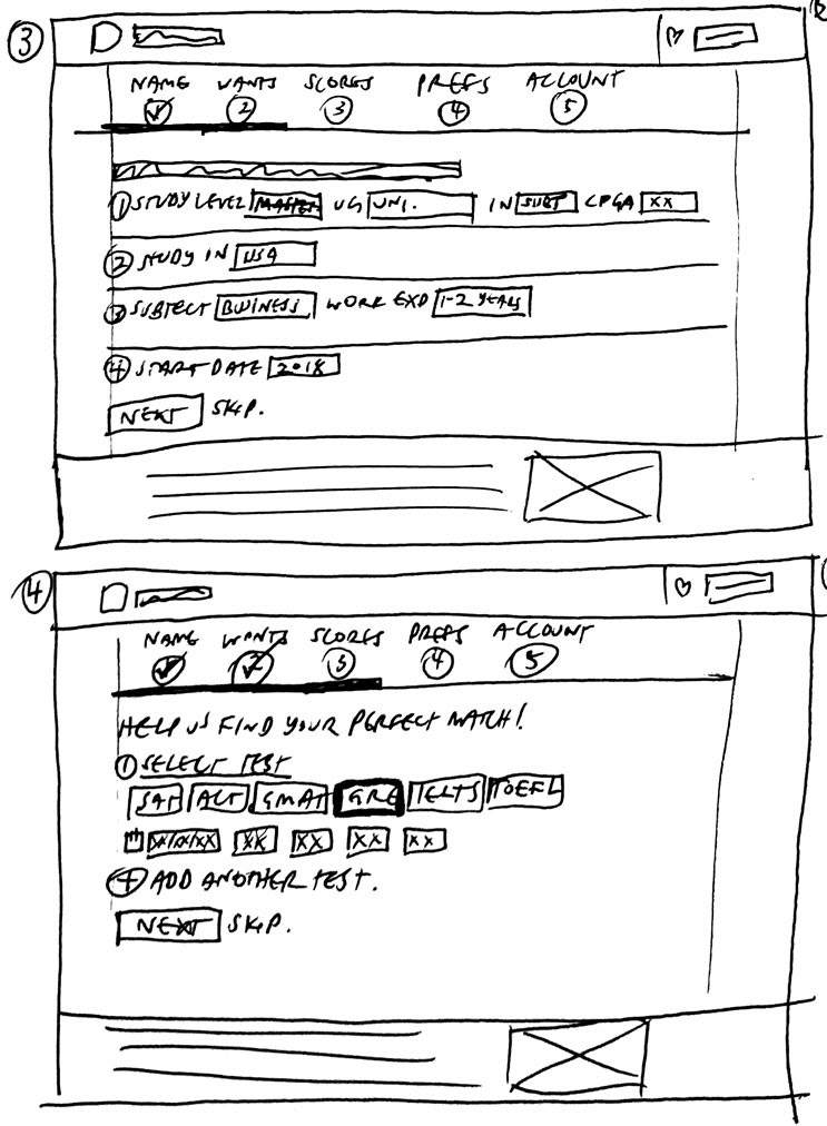
Wizard - Steps 2-3

Wizard - Steps 4-5
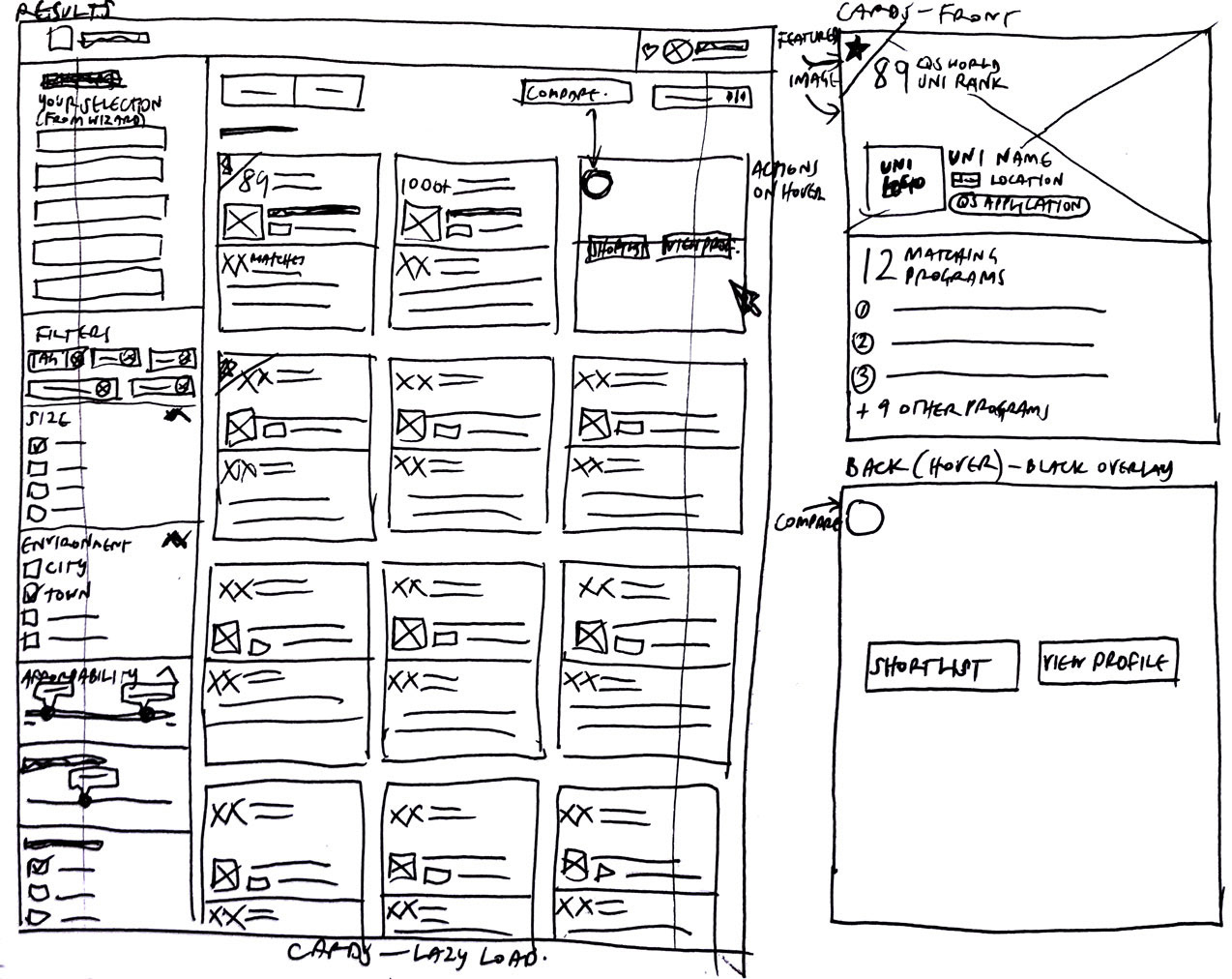
Results screen and cards
design
COMBINING EASE OF USE WITH STYLE
An important part of our process was a recent audit of Top Universities' existing digital assets. This exercise highlighted the need to prioritise accessibility in our design system, an area previously overlooked. We thus set out to create a tool that embodied this commitment to accessibility, marking a significant evolution in our suite of online products.

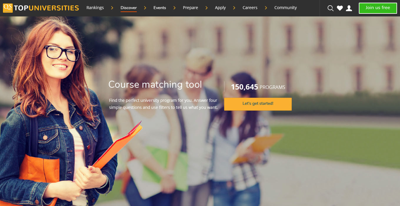
Landing page - Desktop
Wizard - Desktop
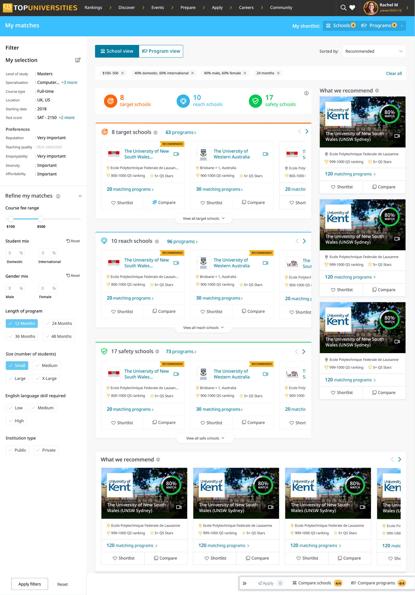
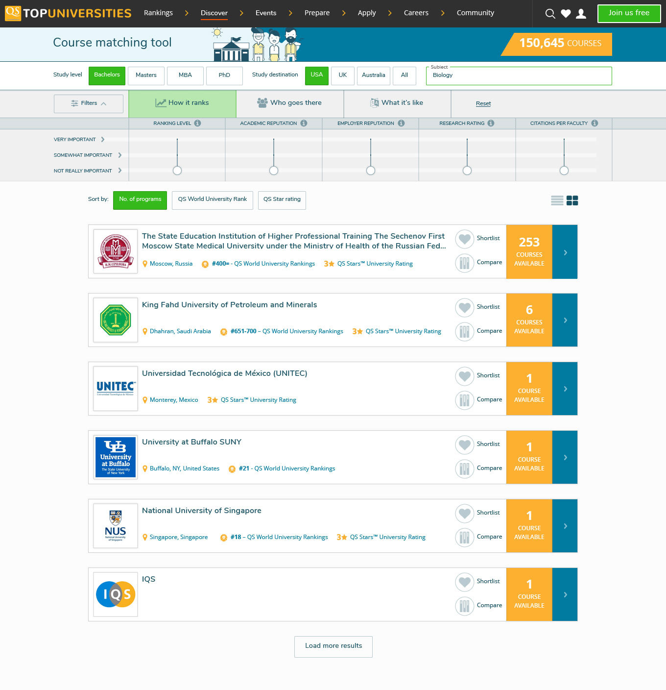
Results screen - Desktop

Compare screen - Desktop

Shortlist screen - Desktop

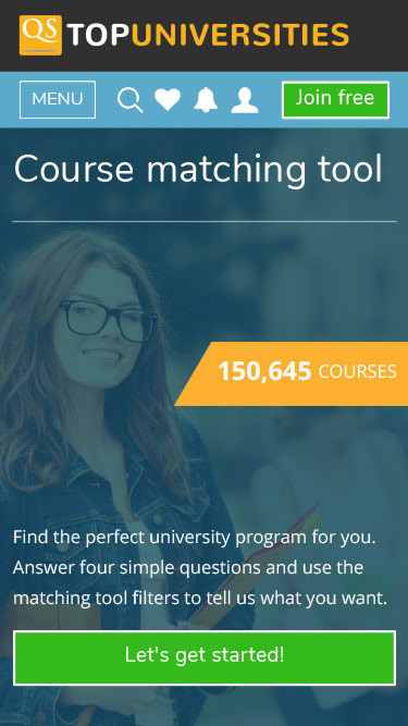
Landing page - Mobile
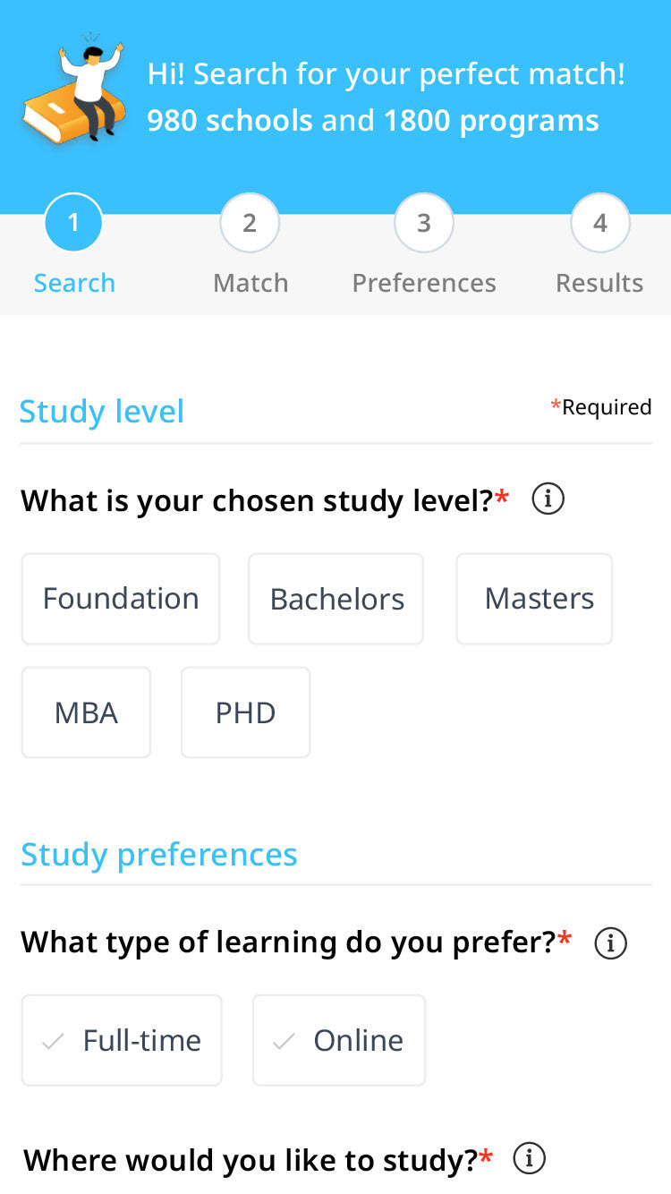
Wizard - Mobile
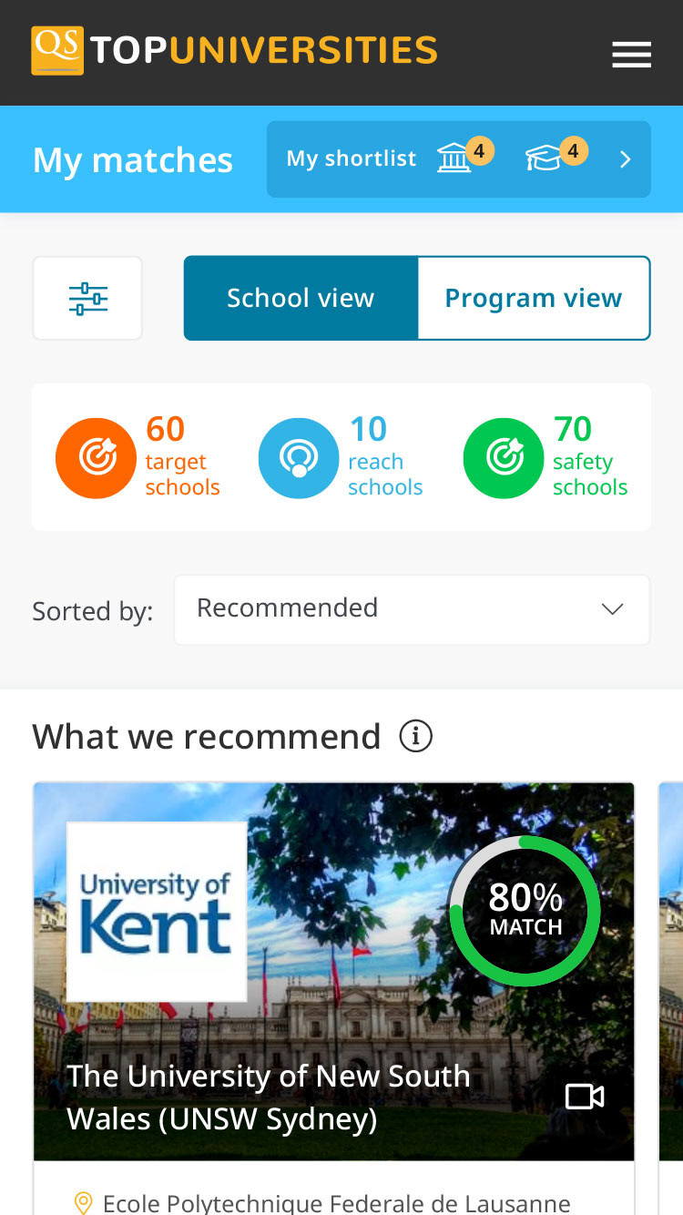
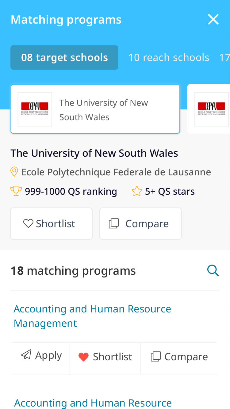
Results screen - Mobile
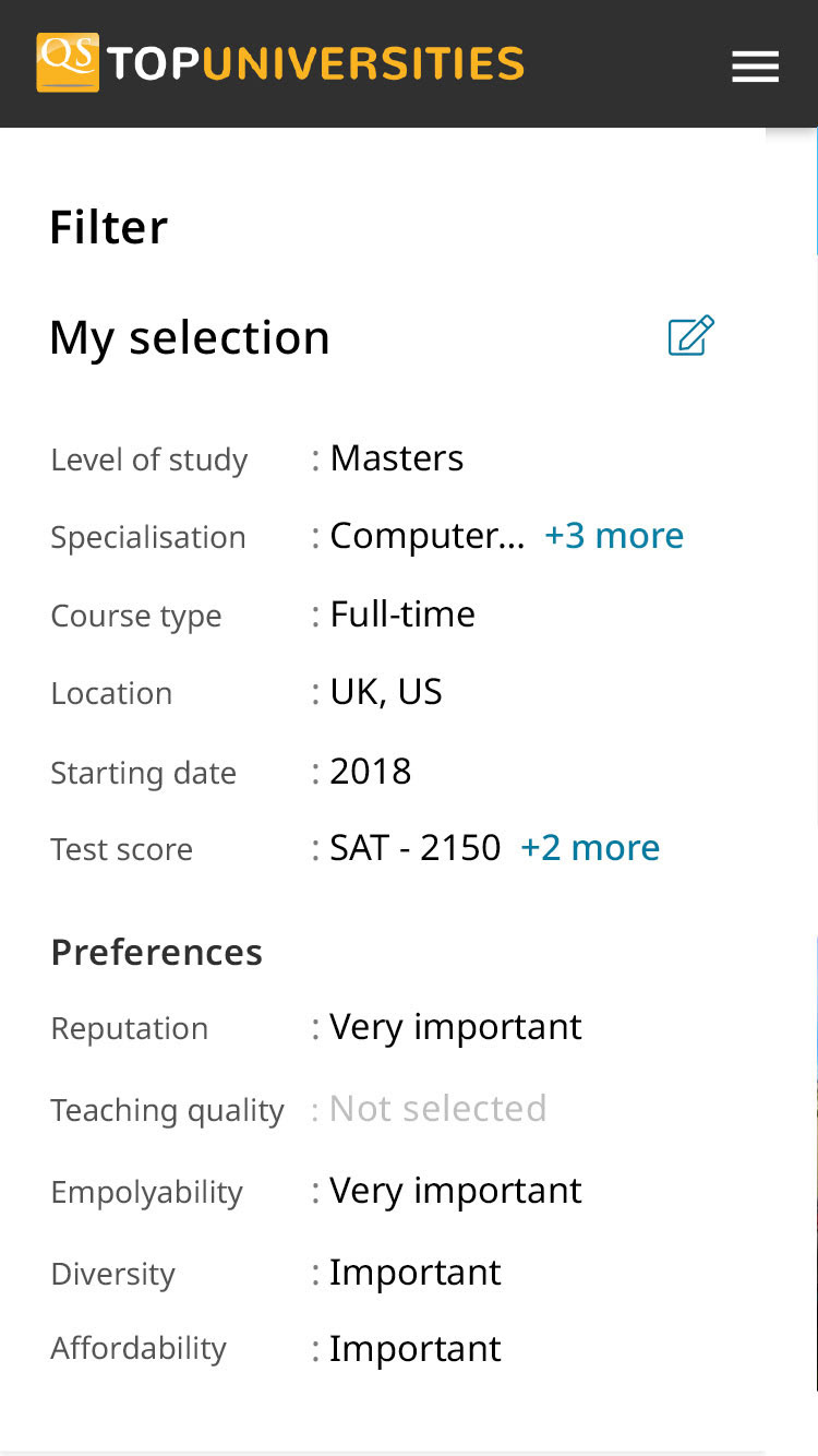
Filter overlay - Mobile
Program overlay - Mobile
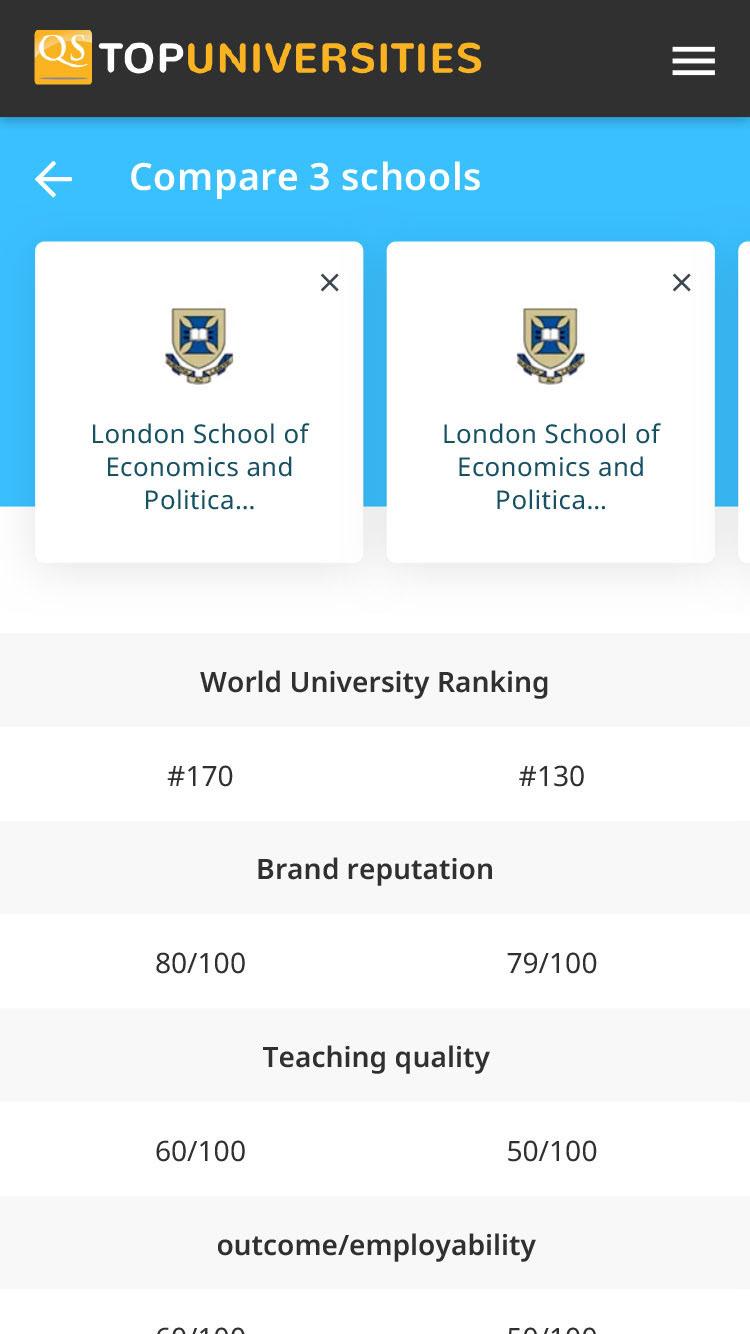
Compare screen - Mobile
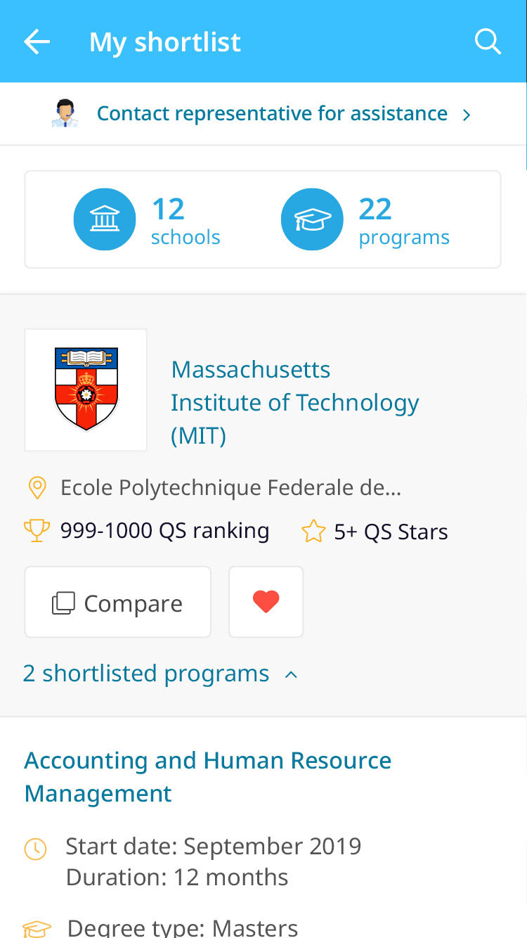
Shortlist screen - Mobile
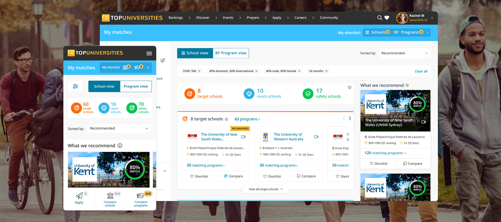
the impact
20 days after release...
Our new programme matching tool saw the light of day in May 2019. The first 20 days brought in 46,000 visitors and substantial increases in page views and session durations. Unfortunately, I was made redundant shortly after this successful launch, preventing me from tracking further progress.
retrospective
EMBRACING CONTINUOUS IMPROVEMENT
As I moved on from the company, I was informed that the team continued to strive for enhancement and refinement. The initiative, which was grounded in the lean UX process, sparked ongoing improvements to the tool after my departure.
Should you have any queries, or if you'd simply like to chat, don't hesitate to get in touch!