
information architecture: topmba.com
Wikipedia describes information architecture as "the art and science of organising and labelling data to support usability." By creating the most effective and intuitive website structure, great user experience can support users in finding the information they require, as quickly as possible.
This is my story of redesigning the information architecture for TopMBA.com — a website that helps prospective MBA students by providing information and assistance with everything from business school choices to career goals.
MY ROLE
collaboration is key
This project ran from December 2017 to March 2018 and I worked as an end-to-end User Experience Designer. I worked in collaboration with senior stakeholders from across the organisation (CEO, departmental heads, product owners), as well as project management and development teams.
I was solely responsible for this project, producing all major deliverables and presenting these to the wider team. My responsibilities included: UX strategy, research, interaction design, visual design and copywriting.
the challenge
Improving user journeys & increasing conversions
TopMBA.com (Wayback machine) was relaunched in June 2017 - a project I had not been part of. I was assigned to the new project to improve the information architecture as there were a number of navigational and discovery issues that arose from the relaunch. Traffic numbers, pages per session and site registrations were down and the bounce rate had increased. Net Promoter Score (NPS) was at an all time low of -8.
A bit lost... The navigation for TopMBA.com after the 2017 relaunch.
Missing links - a large footer which doesn't illustrate the breadth of the website - 2017 relaunch.
kick-off
start as you mean to go on
A kick-off meeting was set up between key stakeholders from across the organisation, product, development and project management teams to define our design strategy. In this meeting, I held a workshop to define key user tasks, pain points with the current design and to gather some thoughts for improvement.
We discussed the cross-promotion of articles as a key objective, as there had been a marked decrease, post-relaunch. The branding aspects of the different ranking releases were also required to be showcased.
collecting the data
research & User-centred ANALYSIS
I started by undertaking a heuristic evaluation of the website and found a number of issues pertaining to information architecture. Ambiguous, jargon-filled terminology, text-heavy product names reducing scannability, clumsy interactions increasing cognitive load, and irrelevant cross-promotional links were just some of the issues that arose.
In tandem, I ran a user survey on HotJar (approximately 700 respondents) to understand user demographics, behaviour, pain points and to get an NPS rating. For supplementary data, a deep-dive into Google Analytics was undertaken to verify user behaviour (who they are, interests, and typical user journeys), overall/key stats, and to compare 2017 (post-launch) vs 2016 (prelaunch).
Findings concluded that the breadth of information on TopMBA.com dictates that we need to accommodate a large number of options and reveal lower-level site pages at a glance. A card sorting exercise was required and the results were to guide the menu structure. A coherent flow or structure to navigation is required. There also needs to be an intuitive categorisation of list items and clear, descriptive, and succinct labels which identify with the user - not the company’s naming conventions.
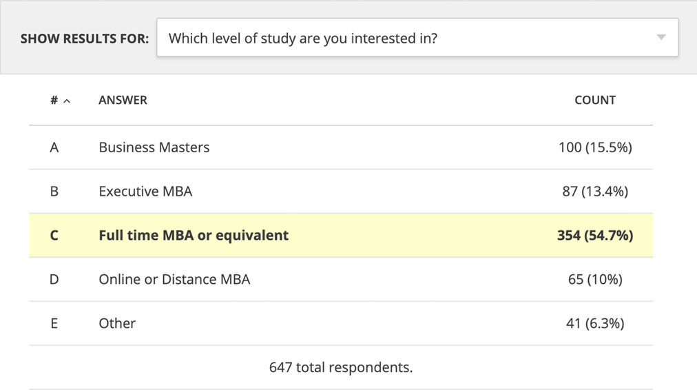
Getting to know our users - HotJar survey.
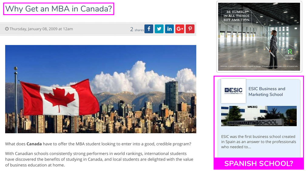
I want to study in Canada - not Spain?
As we had previously interviewed users to create personas, I used the new analytical data to update them for the project and redesigned the layout. I created four in total, with the focus on one primary. Scenarios were assigned to each persona based on user journeys to popular areas of content and task mapping gathered in the kick-off meeting / workshop.
I then conducted an audit of the tagging system in order to assess consistency and to ascertain how to present our content in a way that will make sense to our users. This was also to explore how to cross-promote related content more effectively and to give the users a reason to explore the website further.
Then I created state diagrams and user flows to match user needs with our business objectives - mapping user pathways – from their entry pages through conversion funnels. I also assessed how the user arrived on the website and their pathway from that point.

Personas
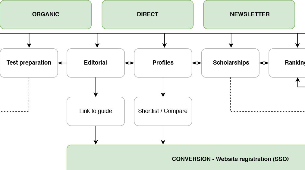
User flow diagram
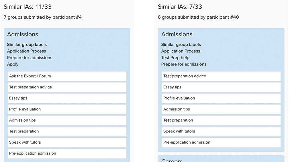
I then used Optimal Workshop to conduct an online, open card-sorting exercise (33 participants) using a list of key navigation items supplied by the Product Owner. Results from the similarity matrix, dendograms and participant-centric analysis (PCA) functions helped to shape decisions and convince stakeholders of the direction we needed to take.
As supplementary data, I created a 'top five' survey (53 participants) via the members database to ascertain the topics most important to users. I also challenged stakeholders over some naming conventions that I deemed ambiguous and ran a survey (15 participants) to verify my thoughts. From these exercises combined, I created a sitemap.
I also gave a presentation to the CEO and other key stakeholders outlining my research and insights gathered.
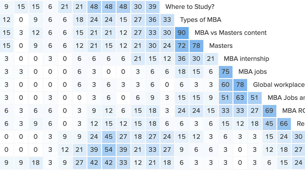
Similarity matrix - Optimal Workshop
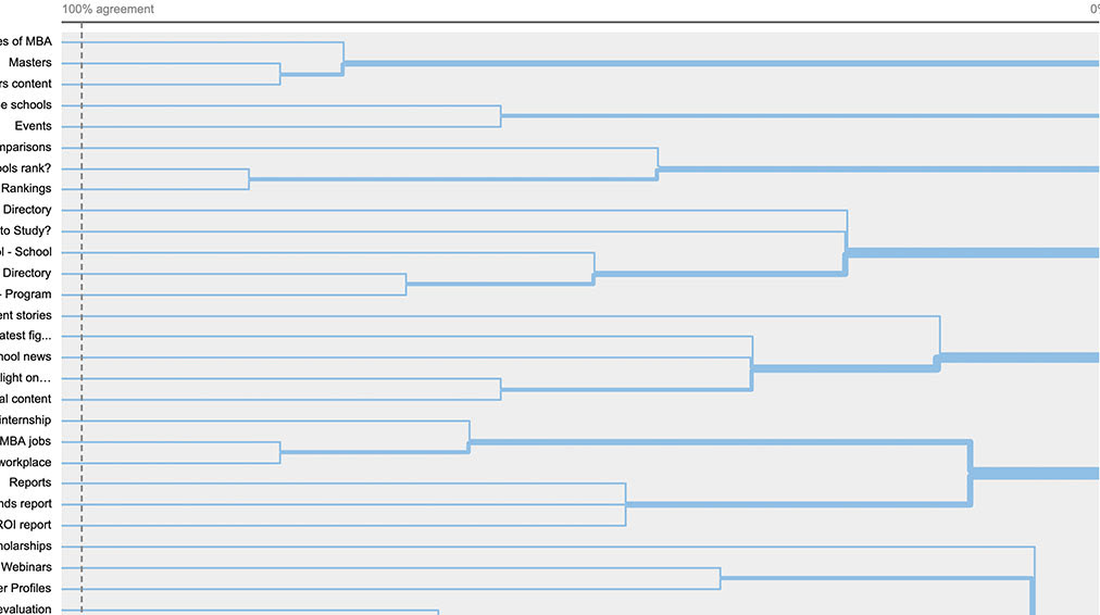
Dendogram - Optimal Workshop
Participant centric analysis - Optimal Workshop
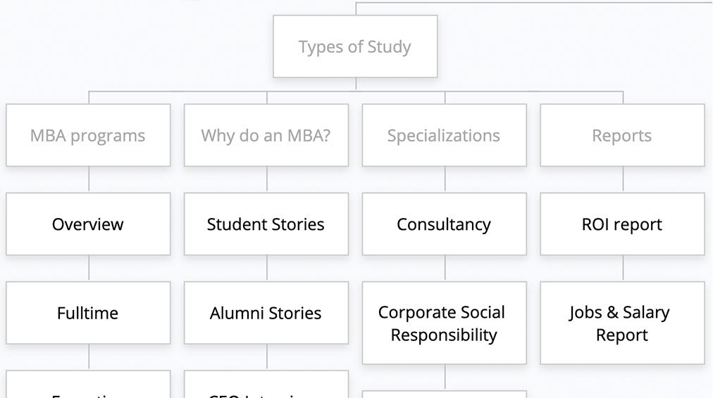
Sitemap
prototyping
I came to the conclusion that there were two viable options to explore: a restructure of the whole website or a mega-menu. I began by sketching out two options in desktop format and two options in mobile format. I then presented these to the Product Owner who requested that I create low-fi prototypes to present to a wider group.
The deadline was extremely tight and, even though I came up with more desirable and well received options for desktop and mobile, business chose to go with the mega-menu and slightly enhanced mobile options that I presented. This was with the view that we can look at restructuring the website when the Tech team has bandwidth in phase two.
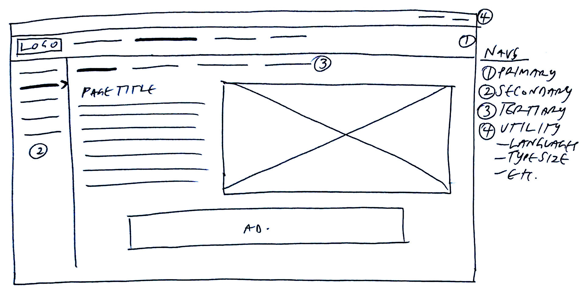
Paper prototype - Desktop
Paper prototype - Mobile
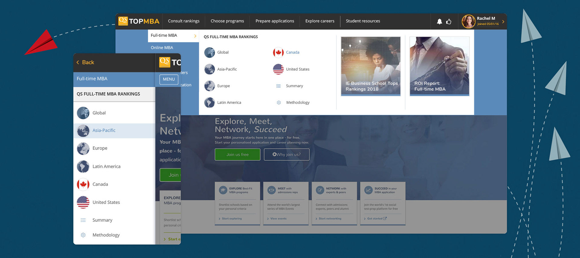
Low-fi: 3-tier navigation - Desktop
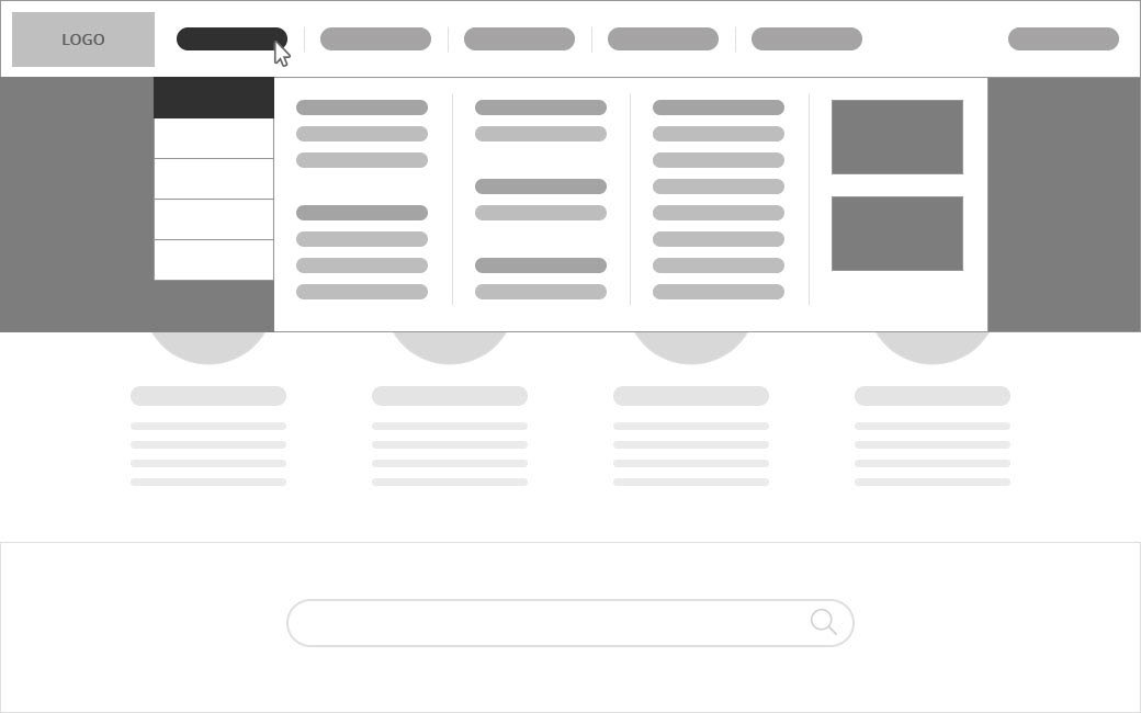
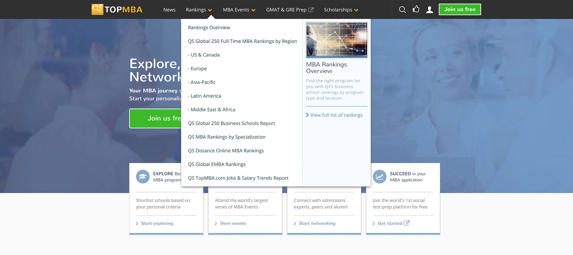
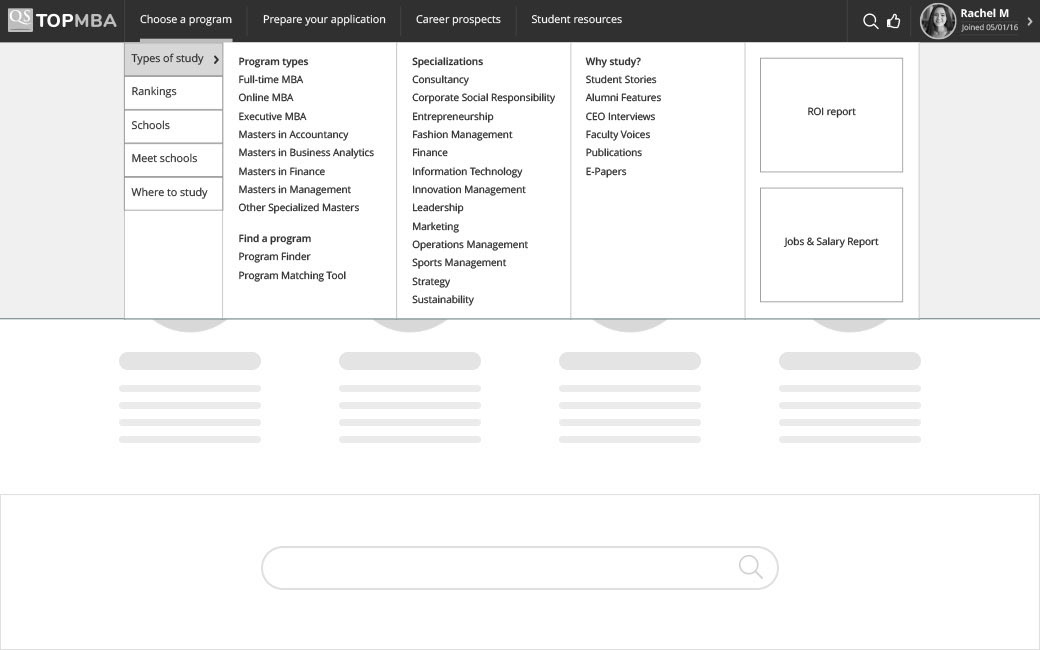
Low-fi: Mega-menu - Desktop
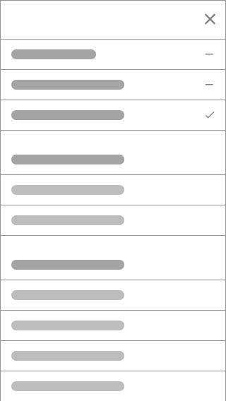
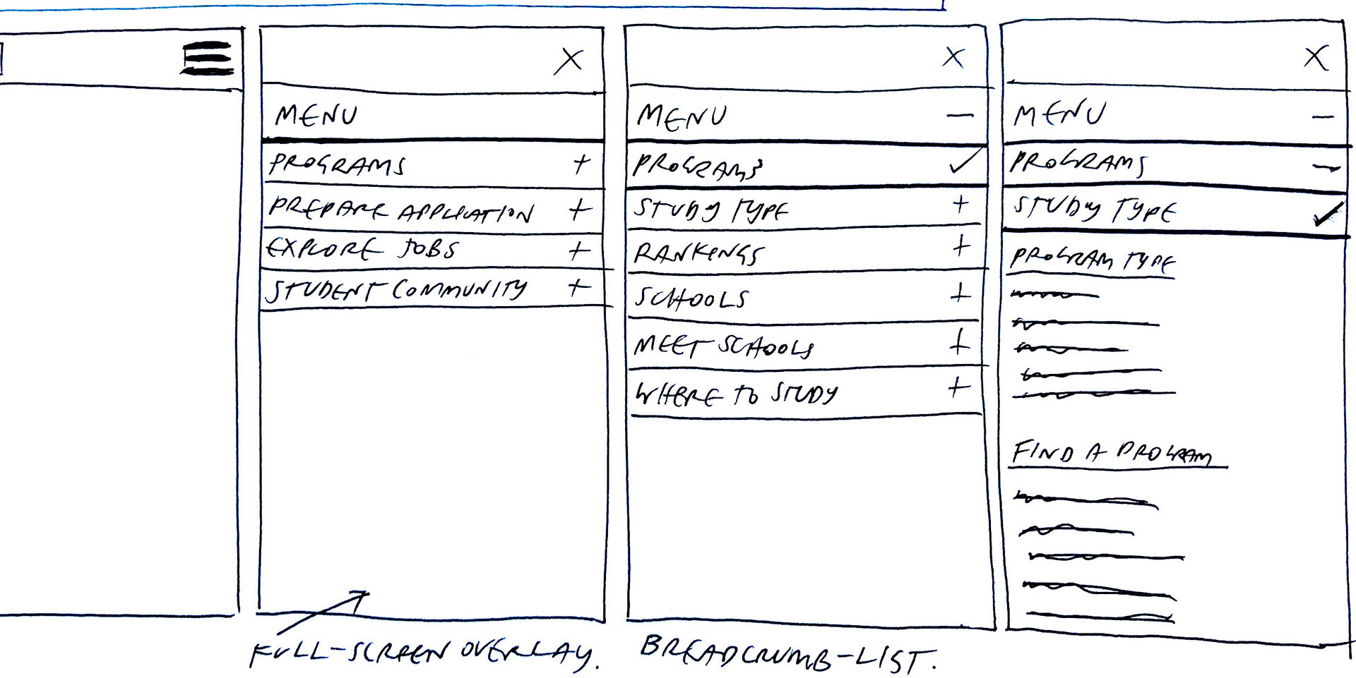
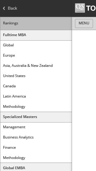
Low-fi: Mobile 1
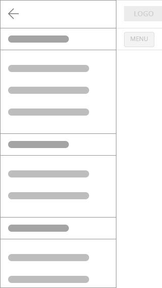
Low-fi: Mobile 2
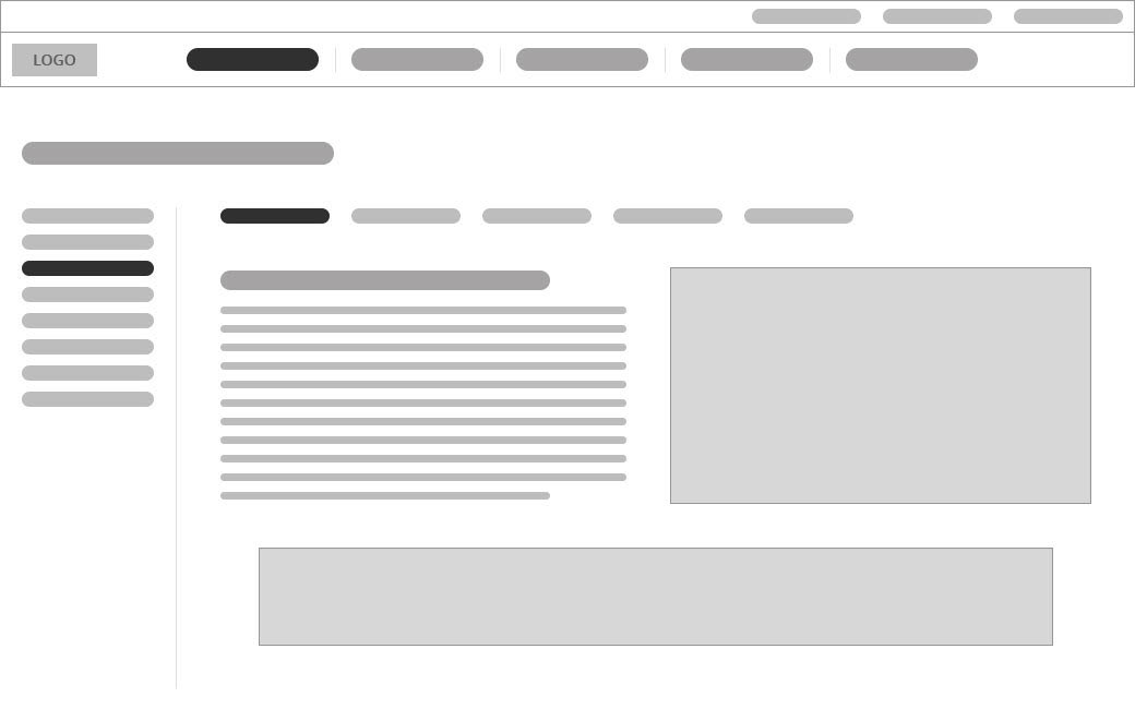
High-fi prototype - Desktop
High-fi prototype - Mobile
design
ui & interactions
My team and I had previously set up a basic design system and an atomic asset library in Sketch for TopUniversities.com. I made a recommendation that we tailor that existing system for TopMBA.com to ensure brand cohesion. This approach would also ensure that both desktop and mobile aspects of the project was turned around in a timely fashion.
I worked closely with project managers and the development team to ensure any interactions adhered to our guidelines and after a few rounds of user testing, we delivered the project for launch.
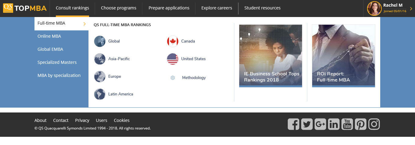
User interface - Desktop - Rankings and footer

User interface - Desktop - Programs
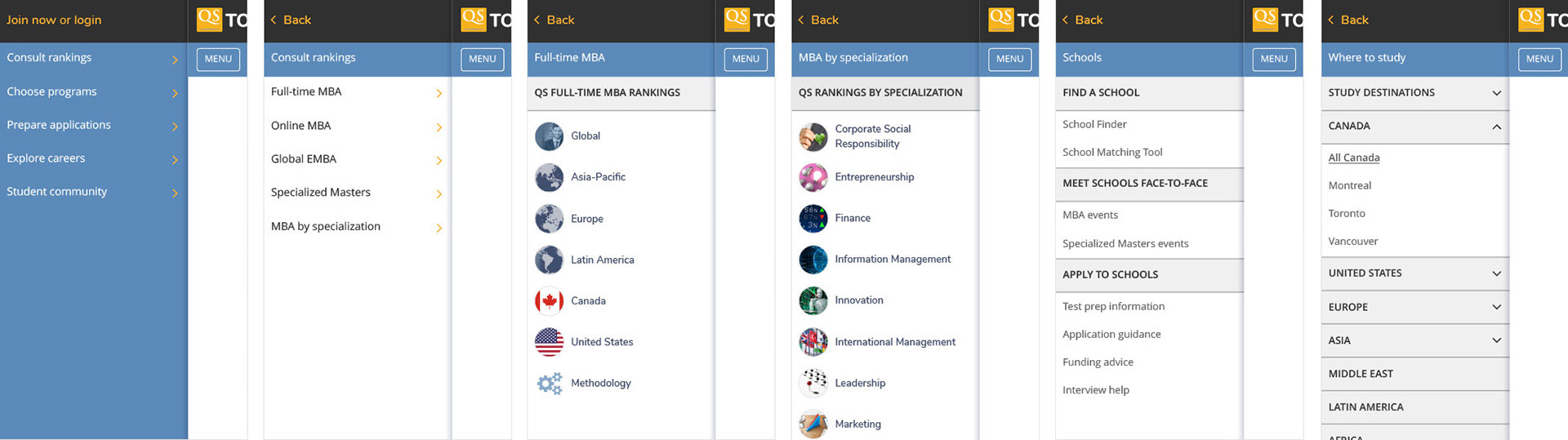
User interface - Mobile
the impact
crunching the numbers
After launching the new navigation on the TopMBA.com website and undertaking some multivariate testing on certain layout aspects, all metrics have grown - with the exception of registration numbers which have been negatively effected by the addition of a field for mobile phone number on all site registrations. This addition was seen as crucial by the leadership group - despite my protests.
My Critical Success Factors (CSF) were as follows:
May 2019
Increase page views: +8.82%
Increase unique page views: +7.81%
Increase pages per session: +13.50%
Increase site registration (full): -12.37*
Increase Net Promoter Score (NPS): +28
Decrease bounce rate: -2.40%
* Due to product requesting a mobile phone number on all registrations
Increase page views: +8.82%
Increase unique page views: +7.81%
Increase pages per session: +13.50%
Increase site registration (full): -12.37*
Increase Net Promoter Score (NPS): +28
Decrease bounce rate: -2.40%
* Due to product requesting a mobile phone number on all registrations
Key metrics included a 36 point increase in NPS from which we can ascertain that users are increasingly happy with the website and that they are finding the information that they require. The increase in pages per session proves that a more robust tagging system which serves relevant, cross-promotional content on every page leads to further discovery.
Although the bounce rate has only incrementally reduced, we can deduce that this is due to the nature of the website, which is predominantly article-based. Users of this type of website generally get the information they require and leave.
retrospective
looking back to go forward
There are always more improvements to make and more tests to do. I still believe that a restructure of the whole website to increase discoverability is the way forward. I have driven my team to consider creating a version of any future desktop projects that utilises a three-tier navigation which includes: a primary nav, a secondary table of contents (TOC) nav and an in-page tertiary nav. This will ensure that further relevant information is readily available, no matter where the user lands on the website.
On the mobile version, I believe that the navigation drawer we currently have can be improved by reducing the amount of layers. This would be achieved by utilising a full-screen adaptive accordion that, like a breadcrumb, shows the users path in button form, above the live selection.
But we'll leave that to phase two... if there is one 😉
But we'll leave that to phase two... if there is one 😉
If you like my work or want to chat, drop me a message!