
site registration
The most successful companies are always customer focussed. From a user experience perspective, they generally follow an iterative process of user-centred analysis and design to create the best possible outcomes. Engaging users throughout this process validates successes and ensures user friction is at a minimum.
When capturing data through registration, it is paramount to ensure the process is as simple and intuitive as possible. Any tedious interactions could lead to a user abandoning their task and have a negative impact on business goals, meaning the product's potential isn't maximised.
This is how I reconfigured site registration forms for the B2C suite of QS products to reduce friction, follow industry best practice,s and improve registration numbers.
MY ROLE
reducing the friction
This project ran from August to September 2018. I worked as an end-to-end User Experience Designer and collaborated with the Head of Discovery, Product Owner, project management, and development teams.
My main responsibilities for this project included: UX strategy, gathering requirements, research, producing UX deliverables, prototyping, and visual design.
the challenge
putting the user first
Registration is near the top of the priority list for any company online. Users are more likely to register when your product or service is irresistible and the information they are disclosing doesn't err on the side of intimacy.
So what happens when company priorities aren't conducive to a positive customer experience? It takes a fair amount of stakeholder management, experimentation, and user testing to ensure any negative aspects of a project are as effortless as possible.
From a company perspective, the main goal of the project was to collect more data with every registration, whether the user wanted to make a long-term commitment, like registering interest with a partner university, or something more mundane, like leaving a comment. A decrease in drop-off rates was also high on the agenda.
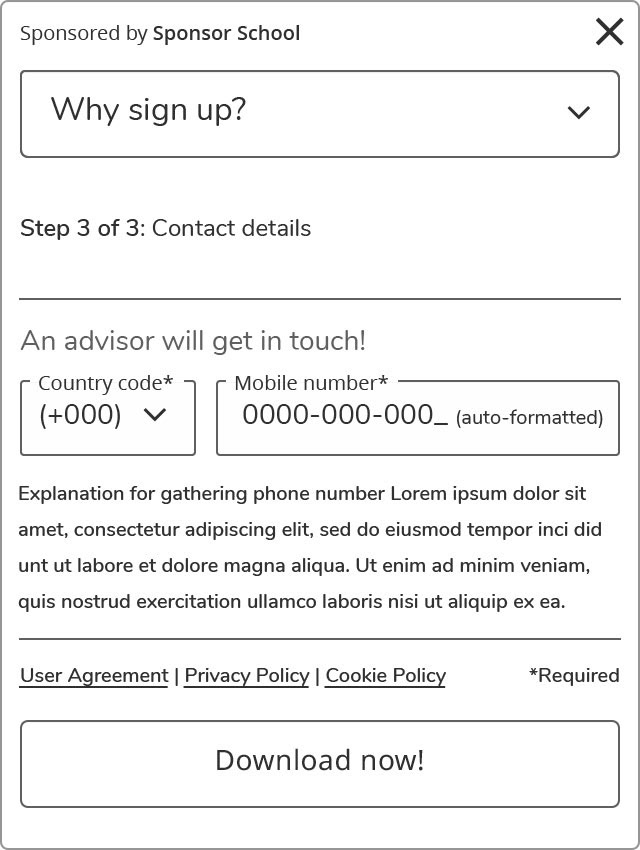
The leadership group had identified a 'Golden 8' which included: name, email, password, study destination, country of residence, study level, subject, and mobile phone number. They also wanted an increase in registration numbers.
I flagged from the outset that requesting a phone number as part of the standard registration process would have an adverse effect, but stakeholders were immovable - wanting to test the value of their service.
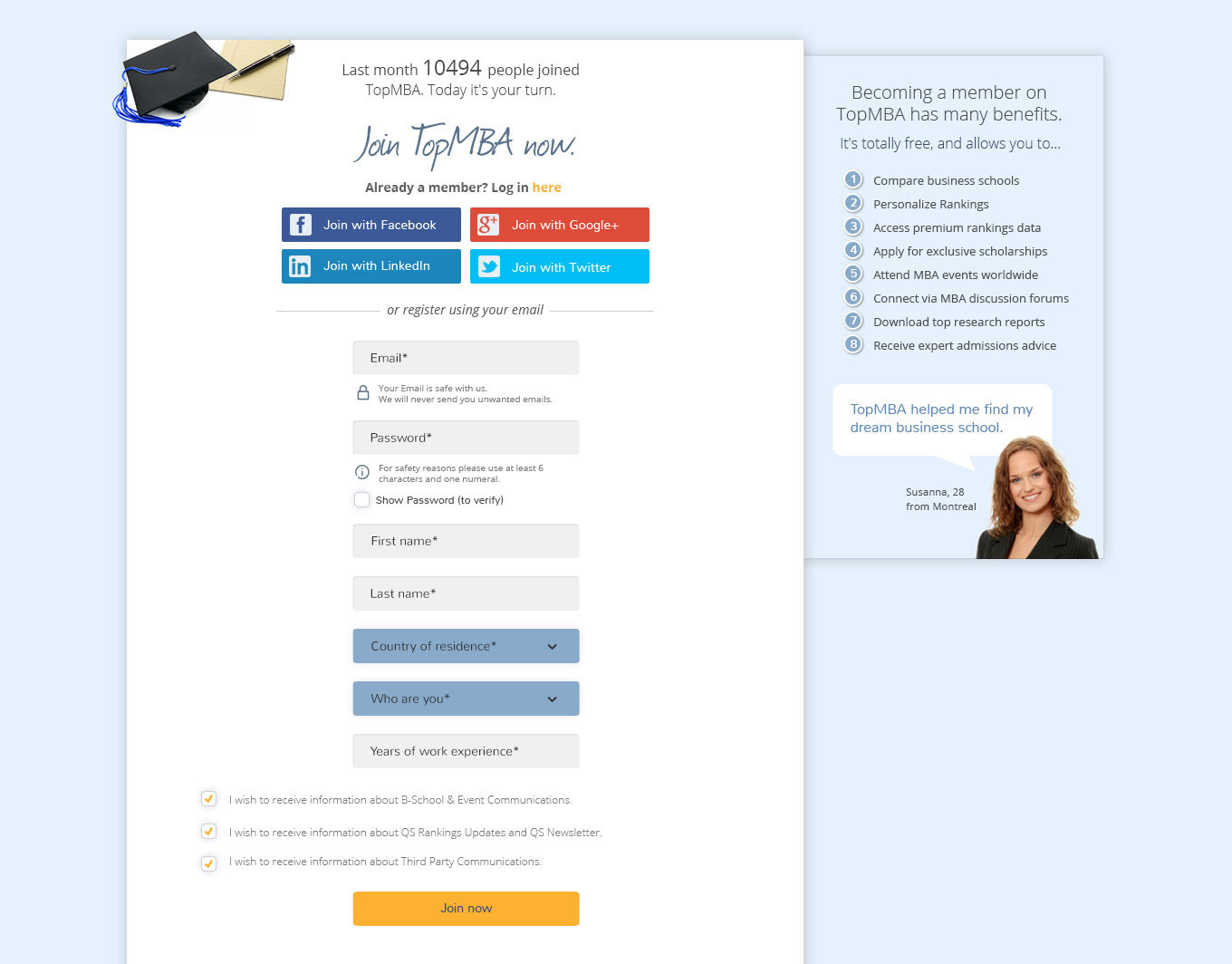
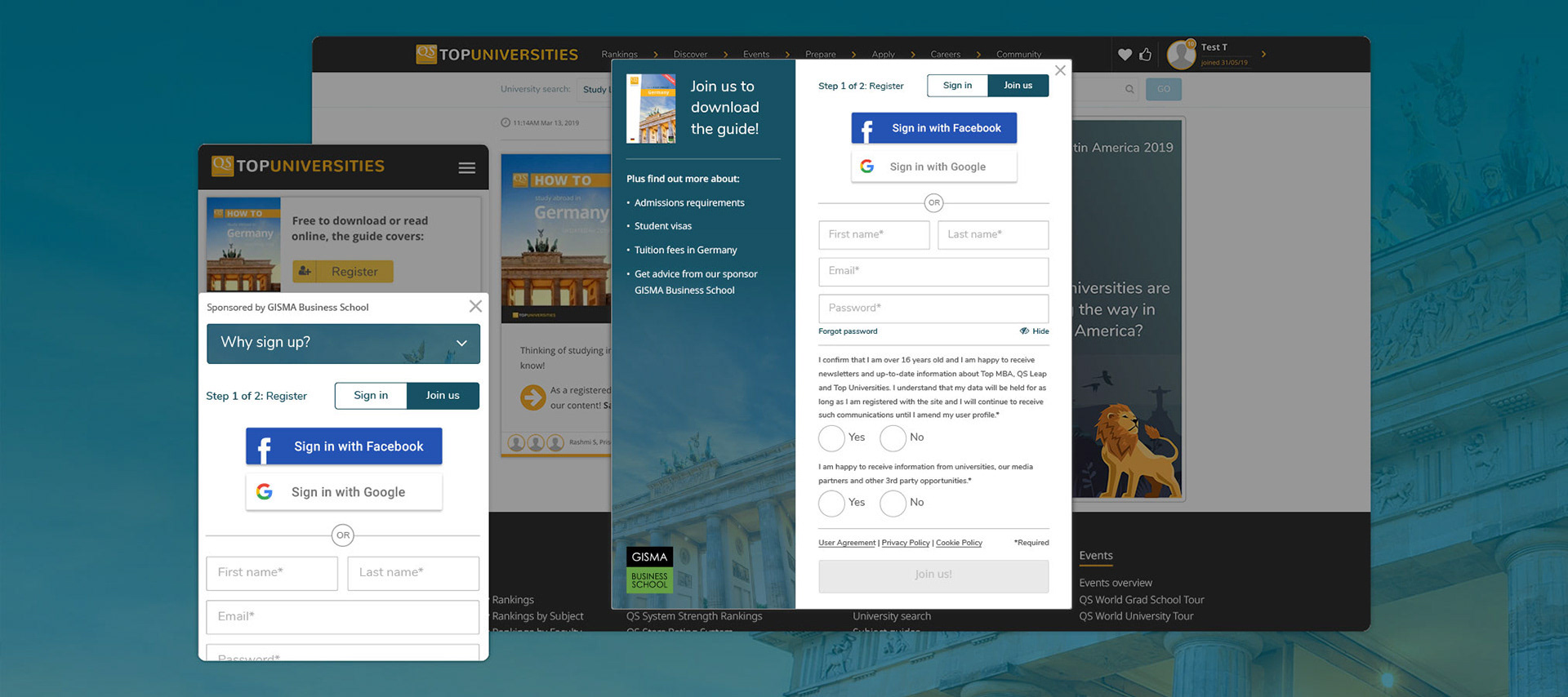
The previous design for desktop...
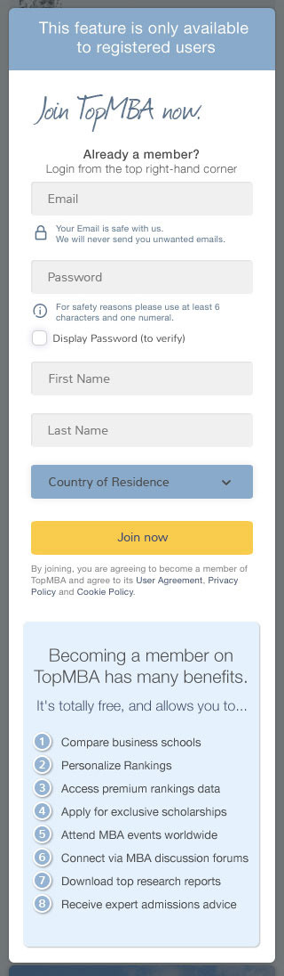
And mobile
kick-off
building trust
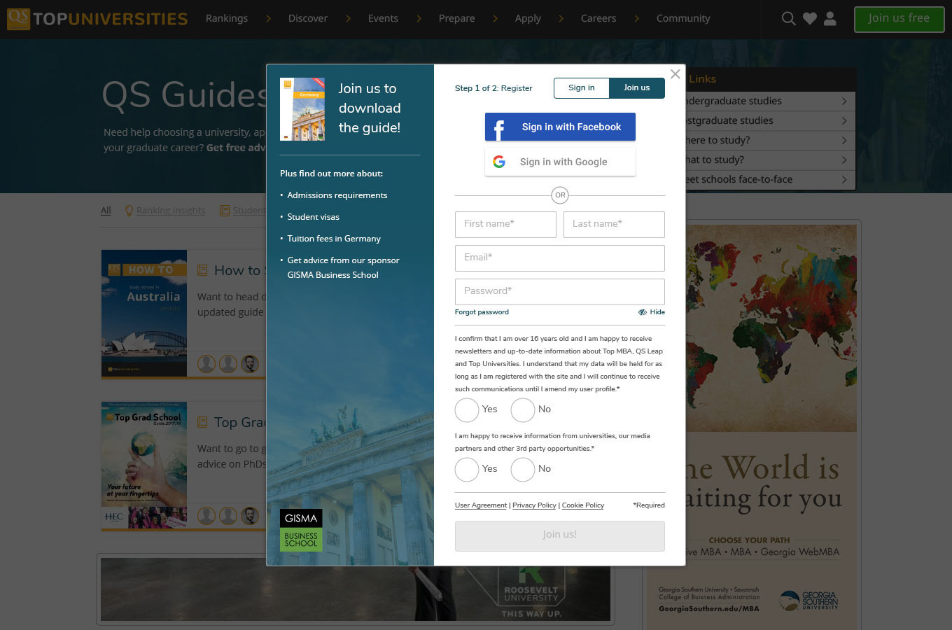
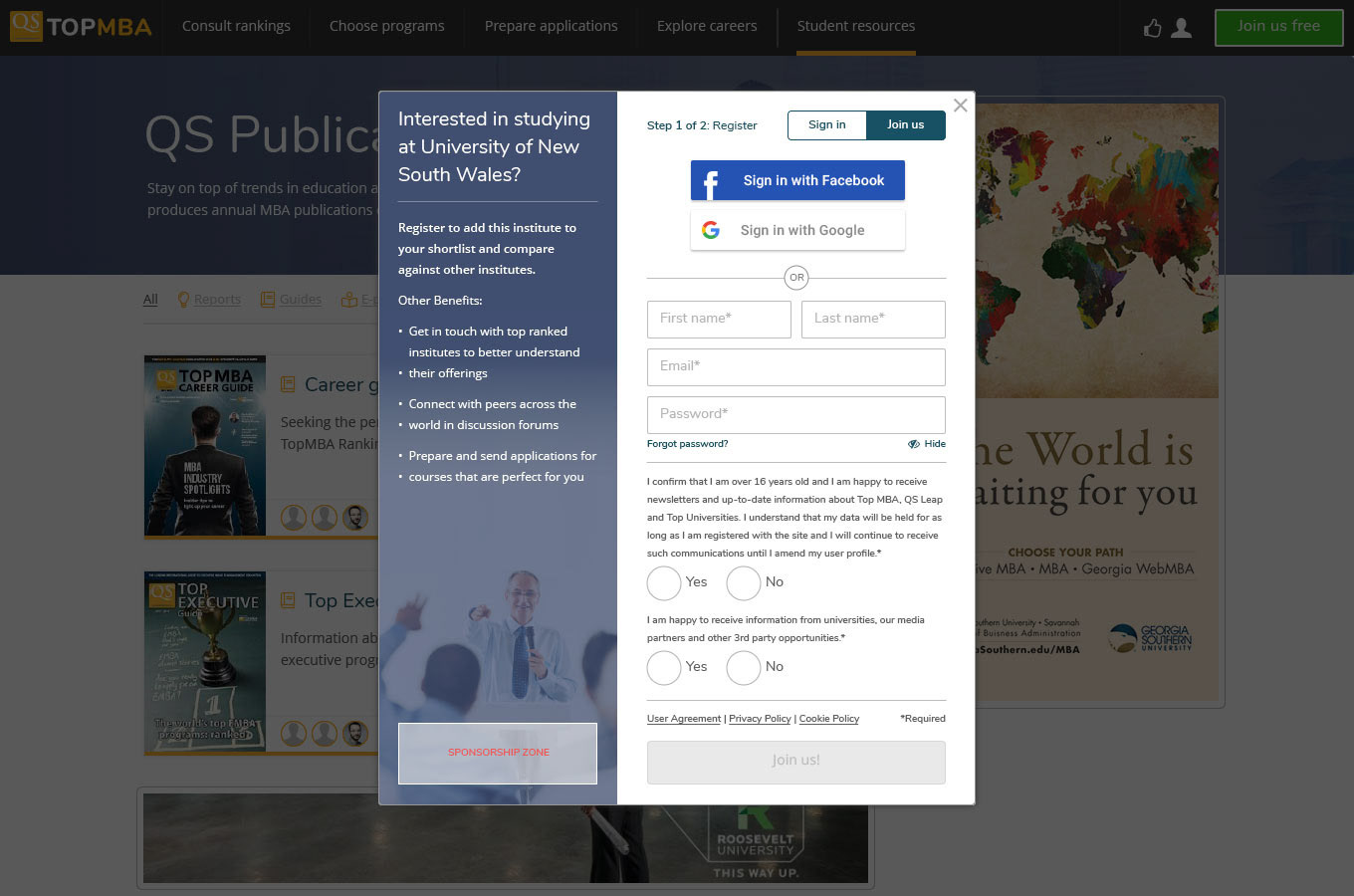
I met with key stakeholders to discuss the design strategy and assess the current offering in-depth. I sketched out some ideas which would improve user journeys at the same time as enhancing engagement. I also talked about the importance of building trust in this transactional relationship through transparency. GDPR compliance was also high on the agenda. Additionally, we discussed the importance of including a clear value proposition and options to log in via social media.
As the registration form in use had its own URL, we talked about the importance of keeping the user in context and decided that a modal window would be the preferred route. I suggested adopting a wizard to break the form into steps and reduce the cognitive load for the user.
I had previously created a design system when working on an event registration project which introduced best practice methodology to base elements, including form fields. I suggested now was the time to assess data from that project and evolve this, bringing these elements up-to-date with any new techniques.
Finally, it was decided that we would do some multivariate testing to assess which concepts worked best.
collecting the data
research & User-centred ANALYSIS
To enhance the existing site registration, I needed to investigate what triggered users into signing up to the websites and to ascertain their attitudes and perceptions of the brand. To better empathise, I needed insights into their behaviours, needs, and motivations.
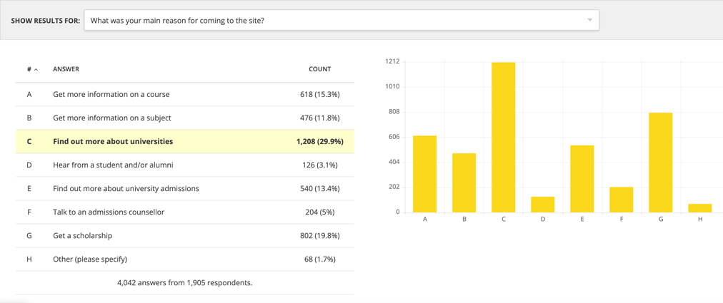
To benchmark our registration process, I undertook some competitor analysis to ensure we were up-to-date with industry standards and to identify opportunities to innovate. I also adopted Google Material design principles to ensure best-practice methodology. To understand user attitudes, I ran a survey on TopUniversities.com using HotJar (1,905 participants). To understand behaviours, I ran a moderated usability test (five participants) of the current design and evaluated web analytics.
Through this research, I verified the importance of a value proposition, especially for those students who were indifferent in providing their personal information. Most students seem to be laser-focussed on their study goals, but will only sign up if they feel there is real value in doing so. I also found that users had a preference to sign on via social media - “Anything to speed up the process is good for me.”
Our personas were adapted for the project to reflect the key audience segments. I then used my research to create scenarios. I also created a task flow diagram and an experience map to plan the UX and determine any user pain points before moving to the design phase.
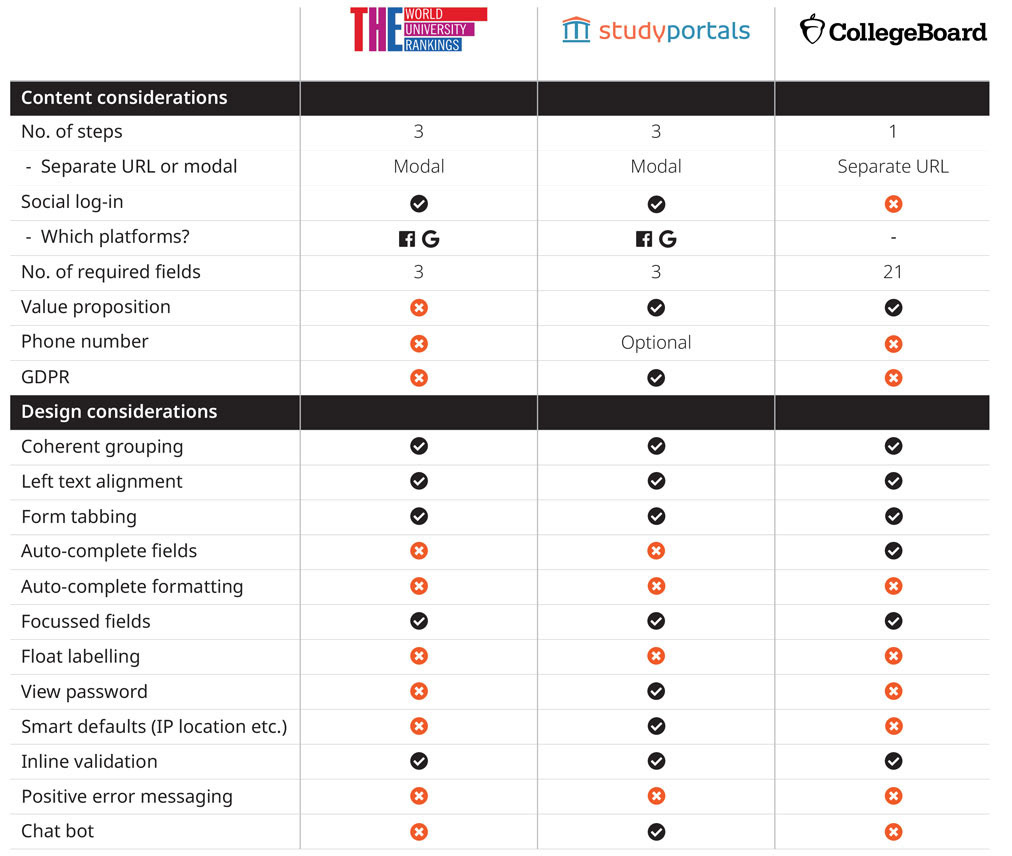
Competitor analysis
HotJar survey
prototyping
By this stage, the leadership group had further discussed the 'Golden 8' initiative and had decided that they were willing to take a hit on registration numbers. They gave me a revised target: 80% of the current registration numbers. I was starting to feel that the job was a bit of a poison chalice, but this development further iterated that I had to ensure every interaction was as seamless as possible.
I began by sketching out some concepts for both desktop and mobile. During the research, users identified that scrolling excessively is a big pain point when filling out a form, especially when using smaller screen sizes. Therefore, my main focus was to ensure that the form fields were grouped in a coherent fashion and that scrolling was to a minimum. In particular, the mobile version was a challenge, especially when including a value proposition.
Low-fi prototypes followed for both desktop and mobile. These were validated and tweaked through user testing. In the testing, a couple of our users mentioned that they wouldn't be happy to give their phone number unless they were applying for a university. This validated my point, but again, the leadership group held firm.
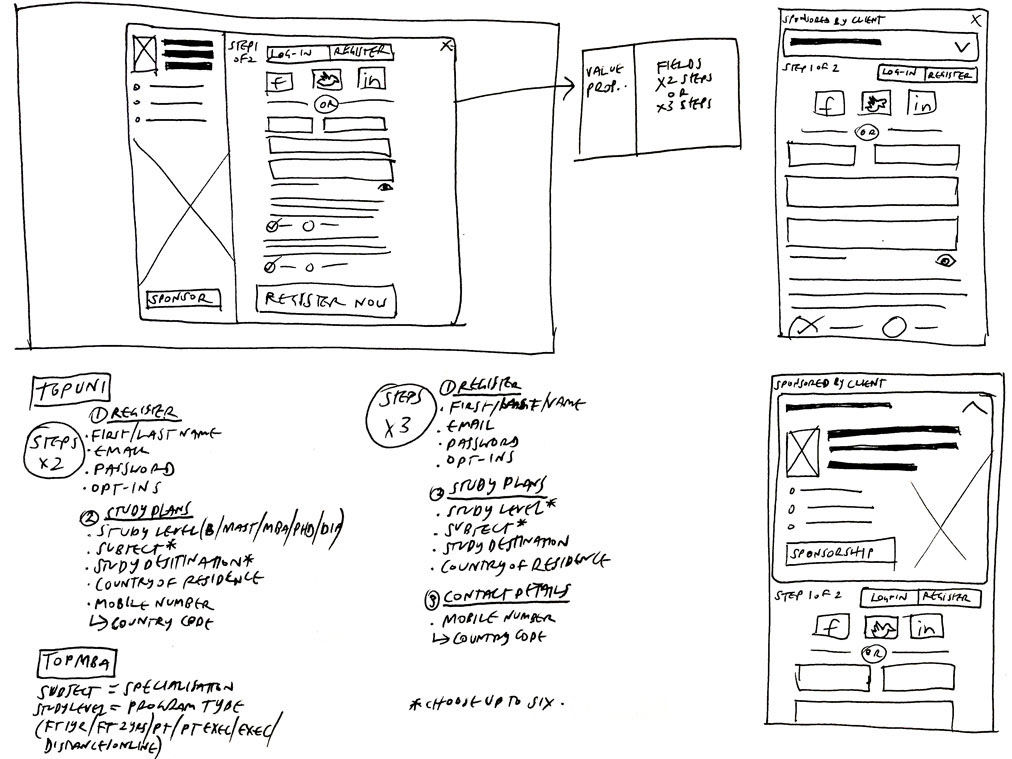
A sample of the paper prototype
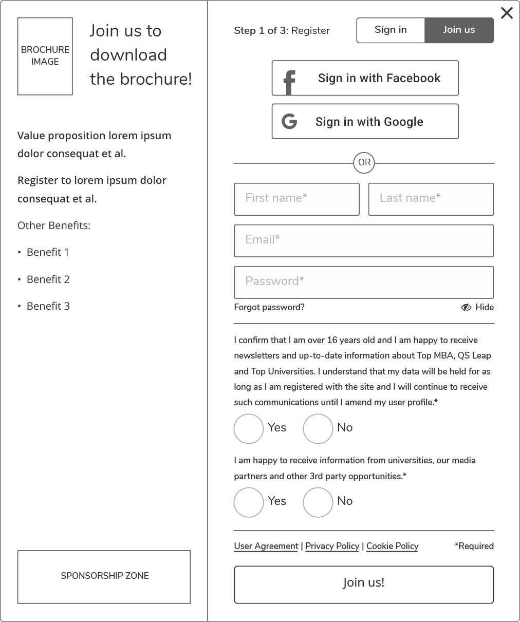
Low-fi - Desktop - Step 1
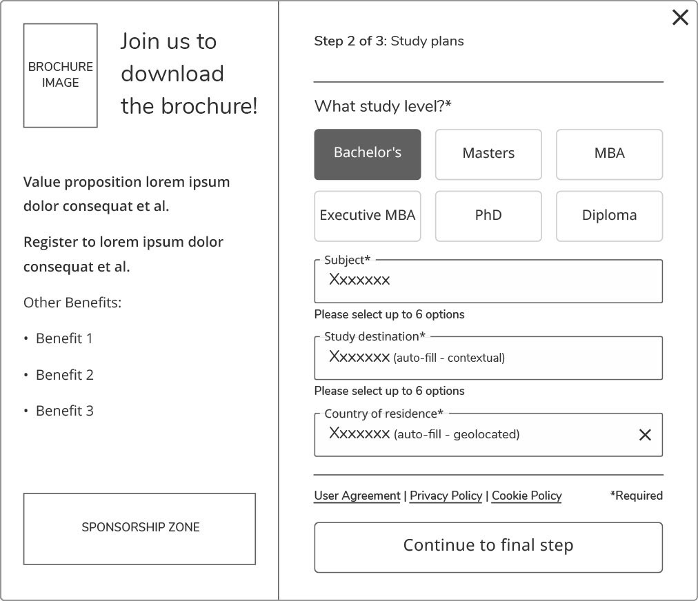
Low-fi - Desktop - Step 2
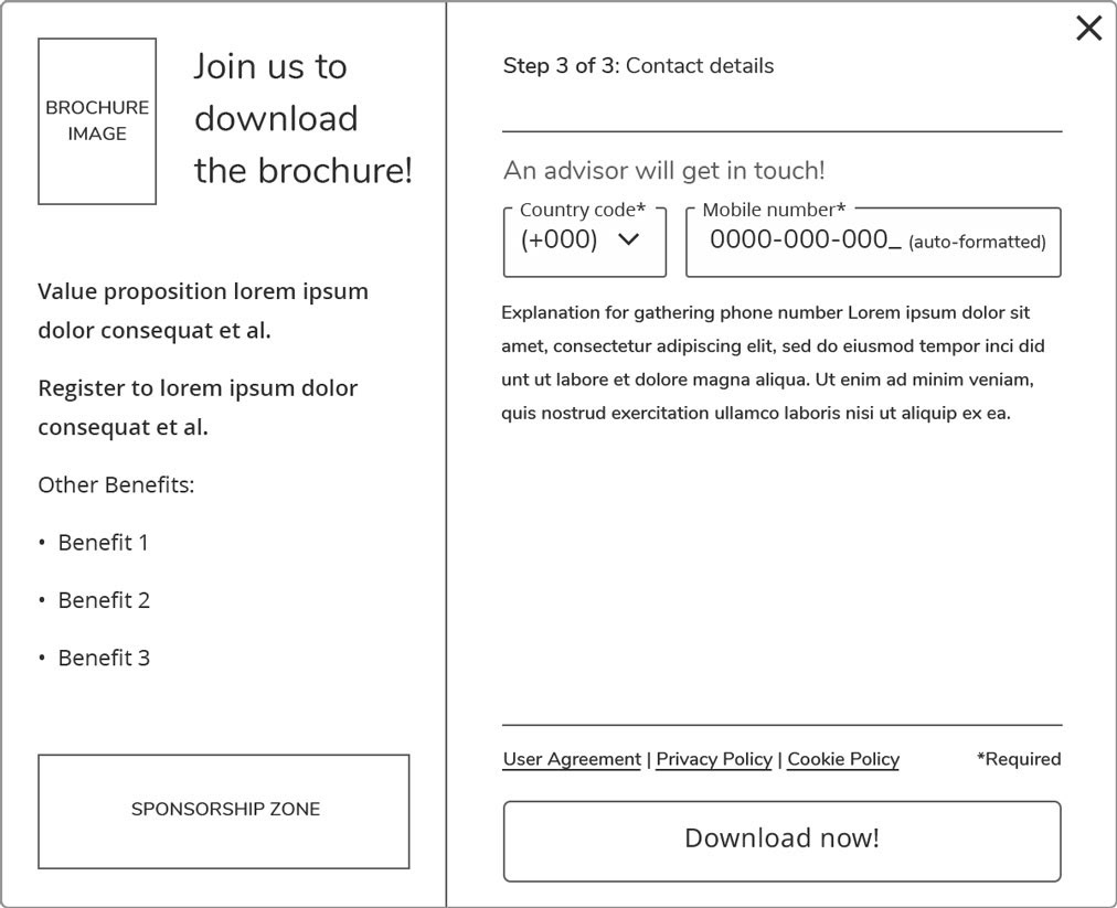
Low-fi - Desktop - Step 3
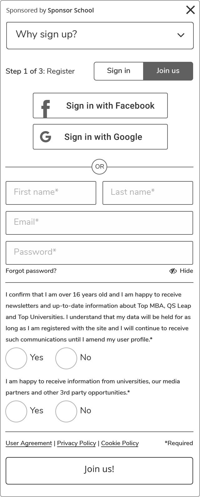
Low-fi - Mobile - Step 1
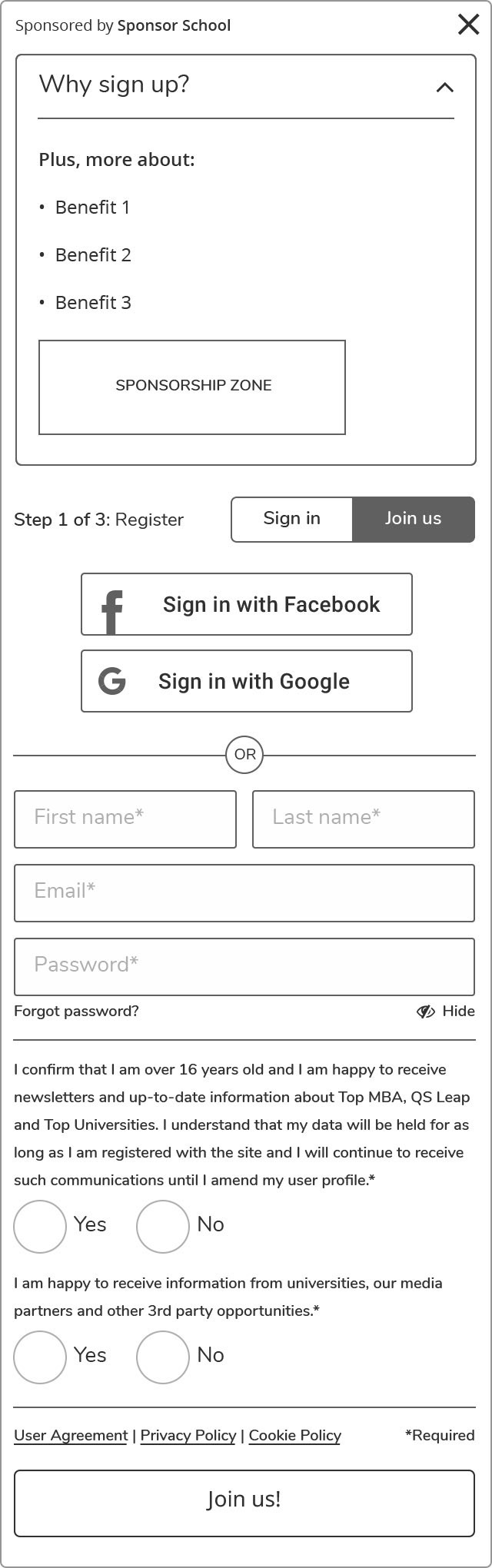
Low-fi - Mobile - Step 1 - Expanded
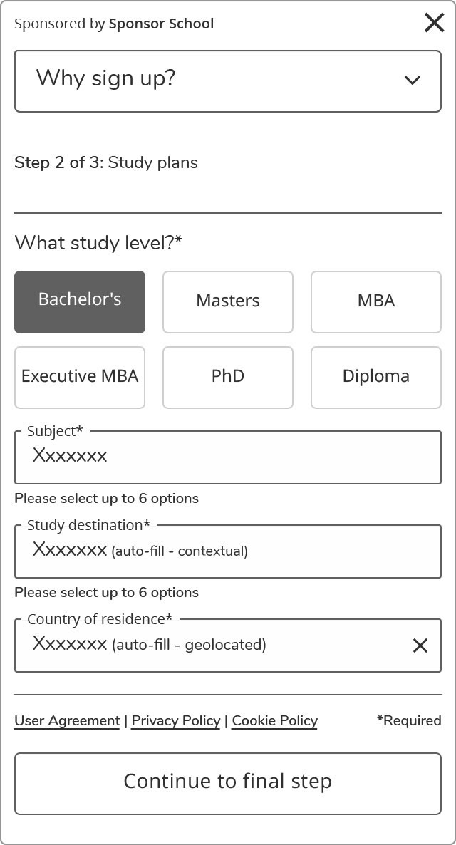
Low-fi - Mobile - Step 2
Low-fi - Mobile - Step 3
design
ui & interactions
Having previously created a design system in Sketch for the event registration project (launched in December 2017), a lot of the leg work had already been done. It would take some tweaks taking usability and accessibility into consideration. I also wanted to do some multivariate testing to validate some new ideas and layout options.
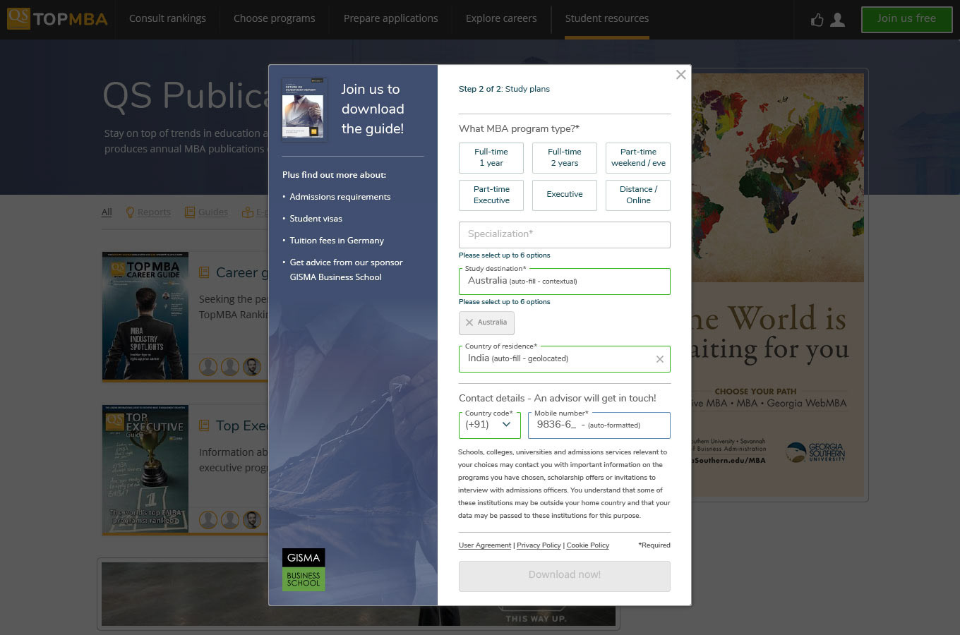
As there are many different reasons to register, I needed to consider an adaptable, contextual design. I worked on screens for desktop (Top Universities, Top MBA, registration funnels) and mobile (Top Universities, Top MBA), and after several iterations and some collaboration with the copywriters, we were ready for launch and more testing.
UI for Top Universities - Desktop
UI for Top MBA - Desktop
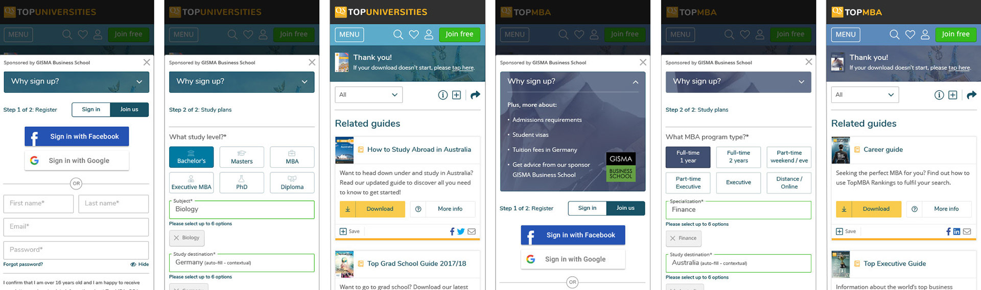
UI for Top Universities and Top MBA - Mobile
Sample of variations - Desktop
the impact
Can I have your number?
On launch, we started our multivariate testing and firmed the most favourable options. We found that a two-step, rather than a three-step wizard led to higher conversion rates. We also found that green call-to-action buttons performed better than our traditionally yellow buttons, amongst other things.
As we expected, the site registration took a downturn with the addition of five fields and in some registration funnels more than others. We found that any forum or commenting registration figures were affected the most.
The bad news was that the site registration fell by -24.71% which was marginally more than the -20% target I was set. It had to be that pesky mobile field!
retrospective
where do I sign-Up?
This project has definitely been a case of prioritising business goals over user satisfaction. Collecting data to sell to universities as qualified leads is the company's key objective, going forward. You win some, and you lose some.
If I could make any improvements to the process I undertook, it would be to engage the user and the stakeholders in a facilitated workshop. I think that this would further help the leadership group understand user attitudes first-hand, before taking calculated risks. As this project proves, they don't always pay off.
In the future, I won't be surprised if the five additional questions are displayed separately - only when there is a high-value proposition for the user. Lower value proposition registrations would only display the first screen which asks for name, email, and password, plus opt-ins. The additional options would appear in a modal window if the user tried to interact with a high-value proposition registration funnel.
If you like my work or want to chat, drop me a message!